Basic usage
Add a button to your UI Studio page to create an interactive element for users.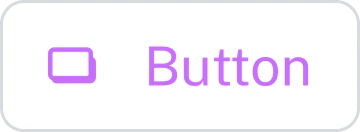
Best practices
Use descriptive labels that clearly indicate the action. For example, View details or Submit form. Avoid vague labels such as Click here.Configuration properties
Text displayed on the button. Keep this concise and action-oriented.
The action performed when the user clicks the button.
URL path for navigation. Supports token syntax:
${TOKEN_NAME} that is specified in the Token Name and Field Name fields.Examples:/home/users/${userId}/products/${productId}/details?tab=${activeTab}
When enabled, the link specified in the
Page Path field opens in a new browser tab.Token settings for button navigation.
Typography settings for the text.
Color scheme for the button.
Border radius in pixels. Controls corner roundness.
0= Square corners4-8= Subtle rounding20+= Pill-shaped button