Description

Creates a textbox

Usage

as element:
<content:input
       label="{string}"
       field="{string}"
       [required]
       [value="{string}"]
       [hidden="{boolean}"]
       [placeholder="{string}"]>
</content:input>

Parameters

ParamTypeDetails
labelstringThe label for the textbox
fieldstringThe name of the field.
required (optional)booleanWhether the field is required not, if it is a warning will be displayed until the field is value. Default:false.
value (optional)stringValue to display in the textbox.
hidden (optional)booleanWhether the textbox should be displayed.
placeholder (optional)stringThe placeholder for the textbox, if no placeholder is defined the label will be used as the placeholder.

Example

Source

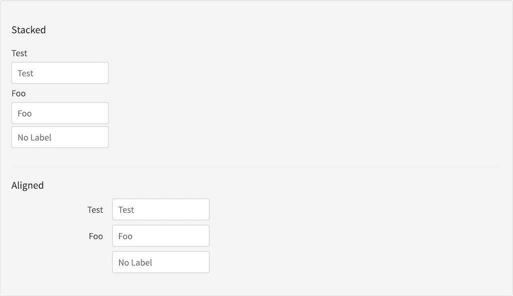
<h3 id="example_stacked">Stacked</h3>
<content:form styling="form-stacked">
    <content:input label="Test" field="test"></content:input>
    <content:input label="Foo" field="bar"></content:input>
    <content:input label="" field="barfoo" placeholder="No Label"></content:input>
</content:form>
<hr/>
<h3 id="example_aligned">Aligned</h3>
<content:form styling="form-aligned">
    <content:input label="Test" field="test"></content:input>
    <content:input label="Foo" field="bar"></content:input>
    <content:input label="" field="barfoo" placeholder="No Label"></content:input>
</content:form>

Result

Result