Description
The popover widget allows the popover content to be displayed in a popup when the popover trigger is clicked.Usage
as element:Directive info
- This directive creates new scope.
Parameters
| Param | Type | Details |
|---|---|---|
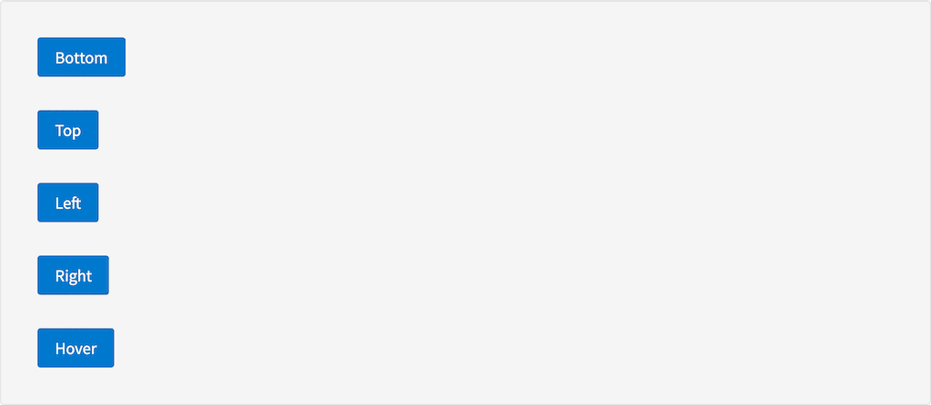
| direction (optional) | string | Where the popover should appear (top, left, right, bottom, bottom-left, bottom-center-left, bottom-center-right). Default: bottom |
| mode (optional) | string | How the popover should open (hover or click). Default: click |
| close-on-click (optional) | string | Close the popover when the popover is clicked on. Default: false |
| close-on-mouseleave (optional) | string | Close the popover when the mouse leaves the element. |
| on-close (optional) | function | Function to call when the popover is closed. |
| hover-timeout (optional) | number | A number to determining the number of milliseconds the popover should be displayed for after the user leaves the popover-trigger. (Only applicable to hover mode.) Default: 1000 |
Example
Source
Result