Documentation Index Fetch the complete documentation index at: https://doc.lucidworks.com/llms.txt
Use this file to discover all available pages before exploring further.
Grid System API Device width when breakpoint overrides default default Sets default layout direction unless overridden by another breakpoint. @xs-width width < 35.5 em @sm-width 600 em ⇐ width < 35.5 em @md-width 35.5 em ⇐ width < 48 em @lg-width 48 em ⇐ width < 64 em @xl-width width >= 80 em
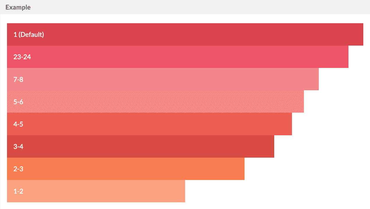
Twigkit uses a response 24 column grid system. The column widths are specified using a ratio of 24ths.
For example at the attribute sm="1-3" to the layout:block tag to set the width to 1/3 of the container width on small screens.
By default layout:blocks will be 100% width.
< layout:grid styling = "text-white" > < layout:block xs = "1" >< layout:box styling = "bg-raspberry-dark" > 1 (Default) </ layout:box ></ layout:block > < layout:block xs = "23-24" >< layout:box styling = "bg-raspberry" > 23-24 </ layout:box ></ layout:block > < layout:block xs = "7-8" >< layout:box styling = "bg-raspberry-light" > 7-8 </ layout:box ></ layout:block > < layout:block xs = "5-6" >< layout:box styling = "bg-strawberry-light" > 5-6 </ layout:box ></ layout:block > < layout:block xs = "4-5" >< layout:box styling = "bg-strawberry" > 4-5 </ layout:box ></ layout:block > < layout:block xs = "3-4" >< layout:box styling = "bg-strawberry-dark" > 3-4 </ layout:box ></ layout:block > < layout:block xs = "2-3" >< layout:box styling = "bg-carrot" > 2-3 </ layout:box ></ layout:block > < layout:block xs = "1-2" >< layout:box styling = "bg-carrot-light" > 1-2 </ layout:box ></ layout:block > </ layout:grid >
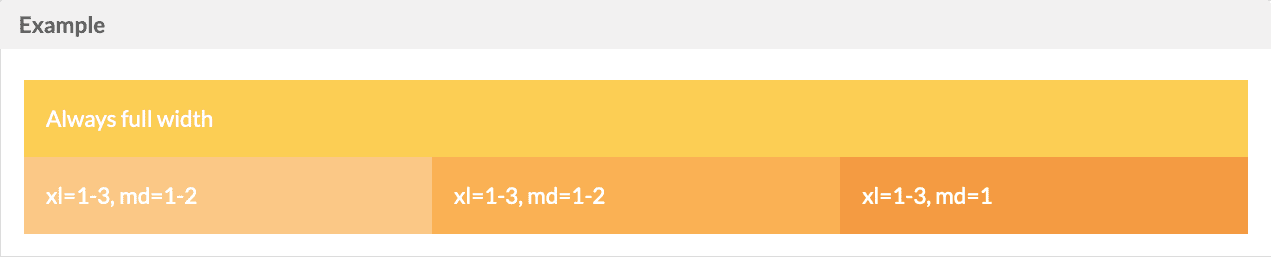
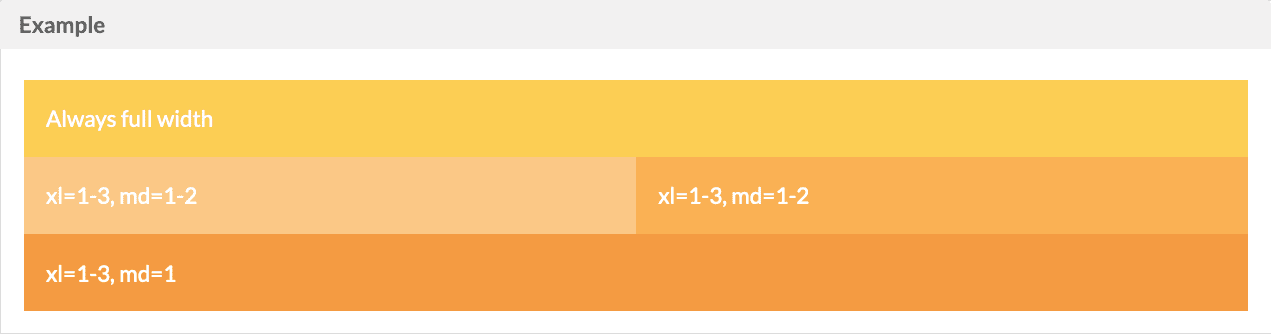
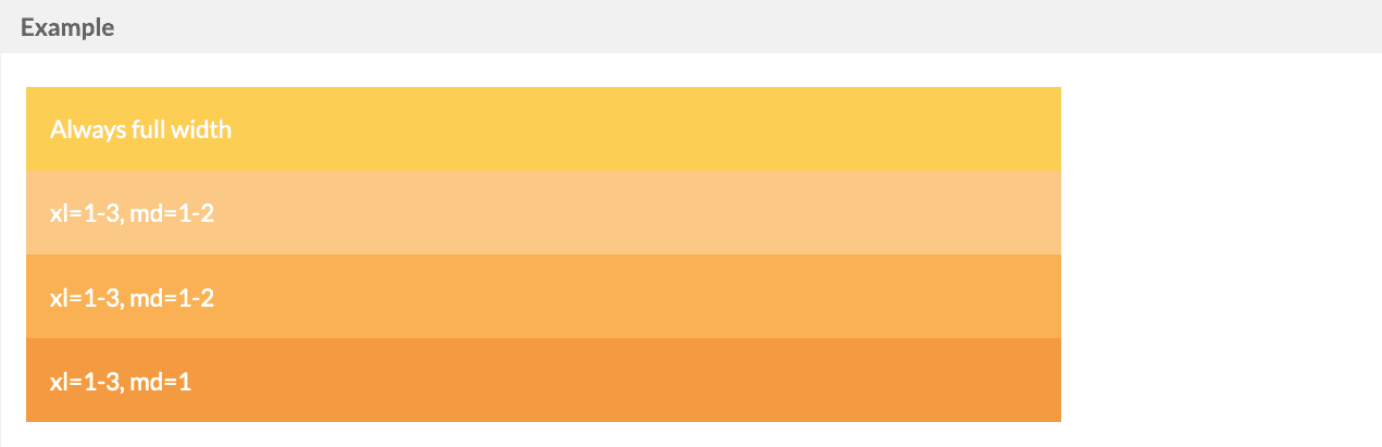
Grid Breakpoints Widths can be specified for each of the xs, sm, md, lg, and xl breakpoints individually.
lgmdsm< layout:grid styling = "text-white" > < layout:block xs = "1" > < layout:box styling = "bg-sunflower" > Always full width </ layout:box > </ layout:block > < layout:grid > < layout:block xl = "1-3" md = "1-2" > < layout:box styling = "bg-pumpkin-light" > xl=1-3, md=1-2 </ layout:box > </ layout:block > < layout:block xl = "1-3" md = "1-2" > < layout:box styling = "bg-pumpkin" > xl=1-3, md=1-2 </ layout:box > </ layout:block > < layout:block xl = "1-3" md = "1" > < layout:box styling = "bg-pumpkin-dark" > xl=1-3, md=1 </ layout:box > </ layout:block > </ layout:grid > </ layout:grid >
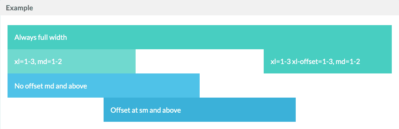
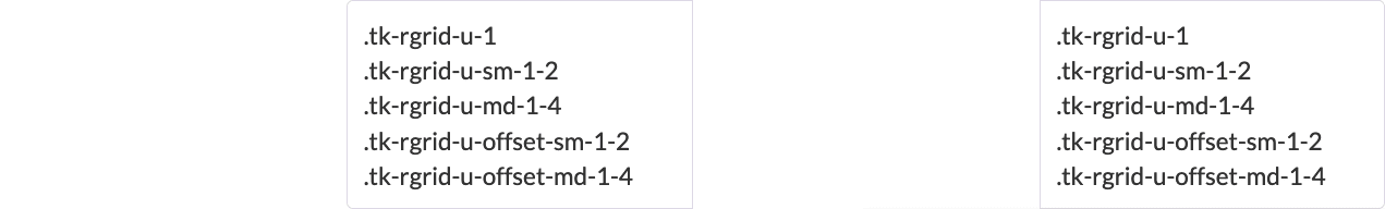
Grid Offsets An offset attribute can be used to push the layout:block to the right, leaving an empty space
< layout:grid styling = "text-white" > < layout:block xs = "1" > < layout:box styling = "bg-mint" > Always full width </ layout:box > </ layout:block > < layout:grid > < layout:block xl = "1-3" md = "1-2" > < layout:box styling = "bg-mint-light" > xl=1-3, md=1-2 </ layout:box > </ layout:block > < layout:block xl = "1-3" md = "1-2" xl-offset = "1-3" > < layout:box styling = "bg-mint" > xl=1-3 xl-offset=1-3, md=1-2 </ layout:box > </ layout:block > </ layout:grid > < layout:grid > < layout:block xs = "1-2" xs-offset = "1-4" sm-offset = "1-2" md-offset = "0" > < layout:box styling = "bg-aqua" > No offset md and above </ layout:box > </ layout:block > </ layout:grid > < layout:grid > < layout:block xs = "1-2" sm-offset = "1-4" > < layout:box styling = "bg-aqua-dark" > Offset at sm and above </ layout:box > </ layout:block > </ layout:grid > </ layout:grid >
Nested Standard Button
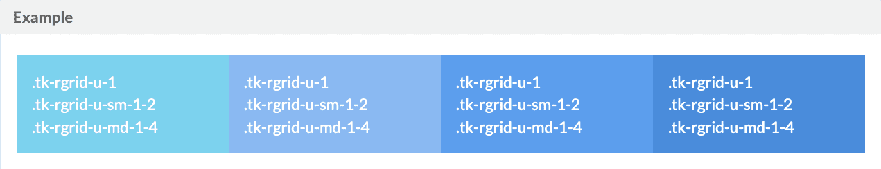
< layout:grid styling = "text-white" > < layout:block xs = "1-1" sm = "1-2" md = "1-4" > < layout:box styling = "bg-aqua-light" > .tk-rgrid-u-1 < br > .tk-rgrid-u-sm-1-2 < br > .tk-rgrid-u-md-1-4 < br > </ layout:box > </ layout:block > < layout:block xs = "1-1" sm = "1-2" md = "1-4" > < layout:box styling = "bg-sky-light" > .tk-rgrid-u-1 < br > .tk-rgrid-u-sm-1-2 < br > .tk-rgrid-u-md-1-4 < br > </ layout:box > </ layout:block > < layout:block xs = "1-1" sm = "1-2" md = "1-4" > < layout:box styling = "bg-sky" > .tk-rgrid-u-1 < br > .tk-rgrid-u-sm-1-2 < br > .tk-rgrid-u-md-1-4 < br > </ layout:box > </ layout:block > < layout:block xs = "1-1" sm = "1-2" md = "1-4" > < layout:box styling = "bg-sky-dark" > .tk-rgrid-u-1 < br > .tk-rgrid-u-sm-1-2 < br > .tk-rgrid-u-md-1-4 < br > </ layout:box > </ layout:block > </ layout:grid >
Image Standard Button
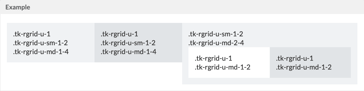
< layout:grid > < layout:block xs = "1-1" sm = "1-2" md = "1-4" > < layout:box styling = "bg-paper" > < p > .tk-rgrid-u-1 < br > .tk-rgrid-u-sm-1-2 < br > .tk-rgrid-u-md-1-4 < br > </ p > </ layout:box > </ layout:block > < layout:block xs = "1-1" sm = "1-2" md = "1-4" > < layout:box styling = "bg-paper-dark" > < p > .tk-rgrid-u-1 < br > .tk-rgrid-u-sm-1-2 < br > .tk-rgrid-u-md-1-4 < br > </ p > </ layout:box > </ layout:block > < layout:block xs = "1-1" sm = "1-2" md = "2-4" > < layout:box styling = "bg-paper" > < p > .tk-rgrid-u-sm-1-2 < br > .tk-rgrid-u-md-2-4 < br > </ p > < layout:grid > < layout:block sm = "1-1" md = "1-2" > < layout:box styling = "bg-paper-light" > < p > .tk-rgrid-u-1 < br > .tk-rgrid-u-md-1-2 < br > </ p > </ layout:box > </ layout:block > < layout:block sm = "1-1" md = "1-2" > < layout:box styling = "bg-paper-dark" > < p > .tk-rgrid-u-1 < br > .tk-rgrid-u-md-1-2 < br > </ p > </ layout:box > </ layout:block > </ layout:grid > </ layout:box > </ layout:block > </ layout:grid >
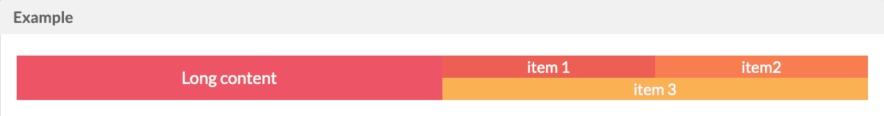
Justify Content < layout:grid > < layout:block styling = "center-content bg-raspberry text-white" md = "1-2" > < p > Long content </ p > < br >< br >< br >< br >< br >< br >< br > </ layout:block > < layout:block md = "1-2" > < div styling = "stretch-content" > < layout:block styling = "center-content bg-strawberry text-white" md = "1-2" > item 1 </ layout:block > < layout:block styling = "center-content bg-carrot text-white" md = "1-2" > item2 </ layout:block > < layout:block styling = "center-content bg-pumpkin text-white full-width" > item 3 </ layout:block > </ div > </ layout:block > </ layout:grid >
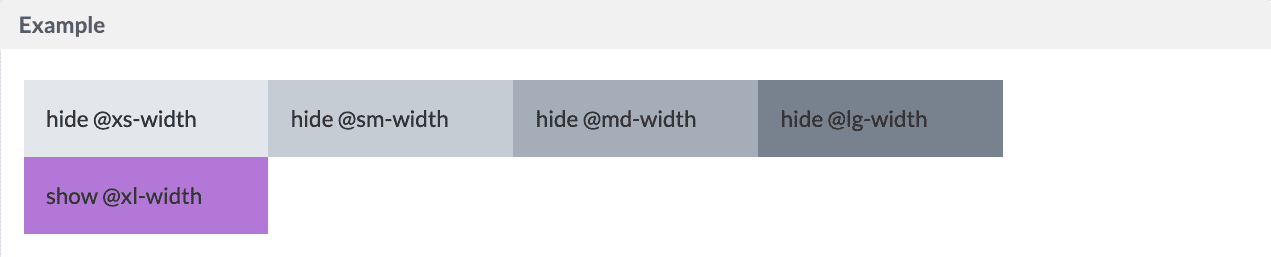
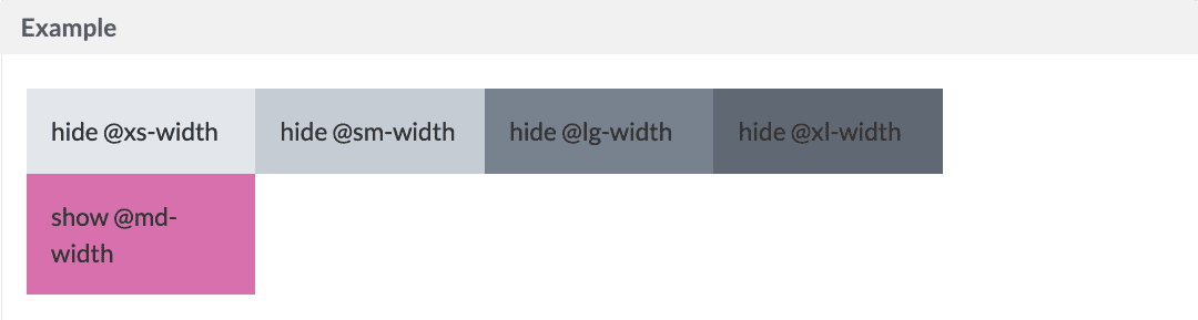
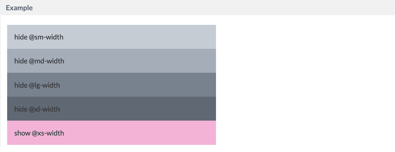
Hide You can hide the layout by using hide or show at your desire size point styling="hide-xs"
xlmdxs< layout:grid > < layout:block md = "1-5" styling = "hide-xs bg-concrete-light" > < layout:box > hide @xs-width </ layout:box > </ layout:block > < layout:block md = "1-5" styling = "hide-sm bg-concrete" > < layout:box > hide @sm-width </ layout:box > </ layout:block > < layout:block md = "1-5" styling = "hide-md bg-concrete-dark" > < layout:box > hide @md-width </ layout:box > </ layout:block > < layout:block md = "1-5" styling = "hide-lg bg-asphalt-light" > < layout:box > hide @lg-width </ layout:box > </ layout:block > < layout:block md = "1-5" styling = "hide-xl bg-asphalt" > < layout:box > hide @xl-width </ layout:box > </ layout:block > </ layout:grid > < layout:grid > < layout:block md = "1-5" styling = "show-xs bg-pink-light" > < layout:box > show @xs-width </ layout:box > </ layout:block > < layout:block md = "1-5" styling = "show-sm bg-pink" > < layout:box > show @sm-width </ layout:box > </ layout:block > < layout:block md = "1-5" styling = "show-md bg-pink-dark" > < layout:box > show @md-width </ layout:box > </ layout:block > < layout:block md = "1-5" styling = "show-lg bg-lavender" > < layout:box > show @lg-width </ layout:box > </ layout:block > < layout:block md = "1-5" styling = "show-xl bg-lavender-dark" > < layout:box > show @xl-width </ layout:box > </ layout:block > </ layout:grid >
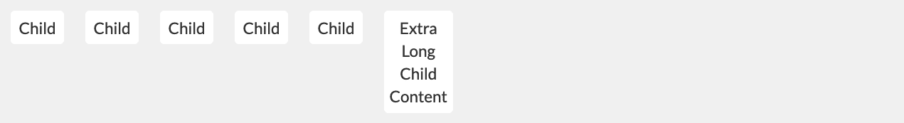
Alignments Default (Stretch)
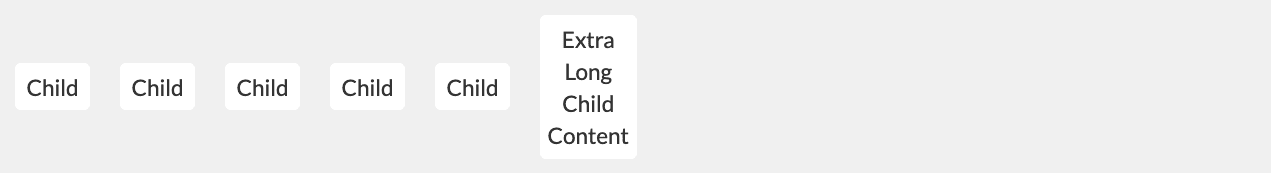
Align All Items Top (.tk-rgrid-align-top)
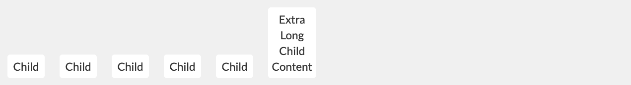
Align All Items Bottom (.tk-rgrid-align-bottom)
Align All Items Middle (.tk-rgrid-align-middle)
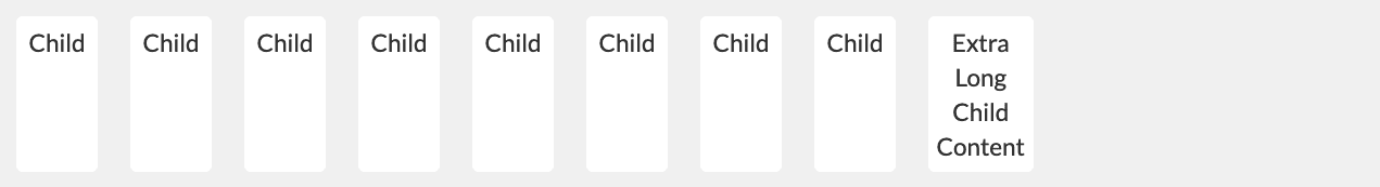
Stretch All Items (.tk-rgrid-align-stretch)
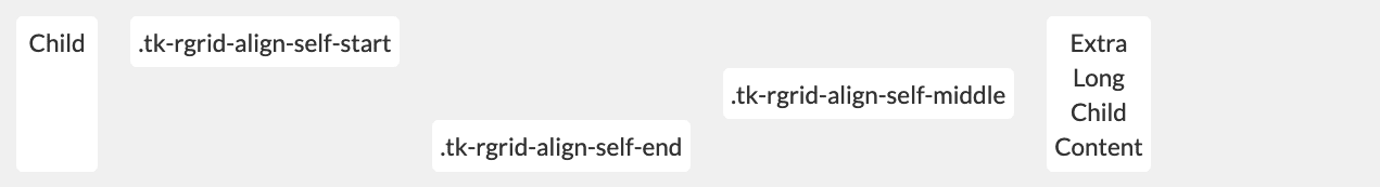
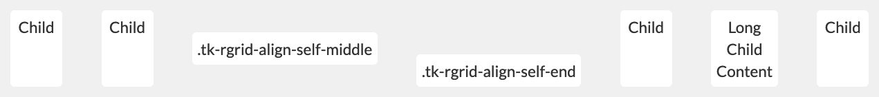
Item Alignment Overrides
Justify Items Default, Align items to the start (.tk-rgrid-justify-start)
Align items to the end of the container (.tk-rgrid-justify-end)
Center items (.tk-rgrid-justify-center)
Even spacing around items (.tk-rgrid-justify-around)
Even spacing between items (.tk-rgrid-justify-between)
Combination
Container Direction Row - Default (.tk-rgrid-direction-row)
Row Reverse (.tk-rgrid-direction-row-reverse)
Column (.tk-rgrid-direction-col)
Column Reverse (.tk-rgrid-direction-col-reverse)
Offsets 