Display Panels
Display panels on a dashboard display information about the data in a single collection. Fusion has these types of display panels:
-
Layout. Use these display panels to organize the panels on a dashboard.
-
Textual Information. Use these panels to display textual information. For example, use a Table panel to displays the values of fields in a set of records.
-
Graphical Visualization. Use these panels to help users to visualize data. For example, display category data in a bar chart and geographical data on a map.
What Data is Displayed
These things determine which data Fusion displays in a display panel:
-
Where the query is sent (to a Fusion query pipeline or to Solr)
-
The collection that contains the data. You can specify this when you create a dashboard, or permit the user to choose the collection.
-
Global query parameters (optional)
-
Input panel configuration settings (possibly including a panel query)
-
A user’s selection of the collection (if permitted)
-
A user’s query
-
A user’s interactions with the data
Layout Panels
These layout panels can help you organize a dashboard:
-
Column. Lay out panels in a column within a row or part of a row. (Instead of the usual left-to-right layout within rows.)
-
Text. Add text to a dashboard, for example, to instruct the user regarding how to use the dashboard, or to describe the data.
Textual Information Panels
These panels display textual information:
-
Doc Viewer. Display documents as single pages of information, and let the user page through documents. Paging through documents does not affect the data displayed in other panels.
-
Full Text Search. Provide full text search capability.
Note: Make a Full Text Search panel wide. Start with Span = 12. Depending on the content, you might be able to make it narrower. If you make a Full Text Search panel too narrow, content and controls can be inaccessible.
-
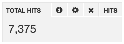
Hits. A Hits panel displays statistical information about the hits returned by the query, including all filters that are applied to the query. The default information is the count (number of hits). You can display the count, minimum, mean, maximum, sum, standard deviation, the sum of squares, and/or the number of hits that lack a value for a field.
-
Table. Display data in a table.
Note: Make a Table panel wide. Start with Span = 12. Depending on the content, you might be able to make it narrower. If you make a Table panel too narrow, content and controls can be inaccessible.
Graphical Visualization Panels
Most display panels are graphical visualization panels. They visually present the data requested in the input panel(s), subject to configuration of the display panel and to any global filtering. Panels for visualizing information graphically are:
-
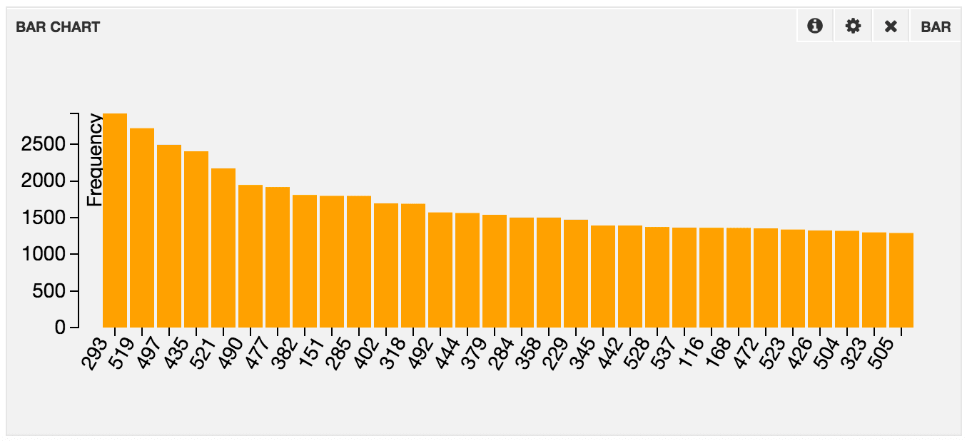
Bar. Graph data as frequencies in a bar chart.
-
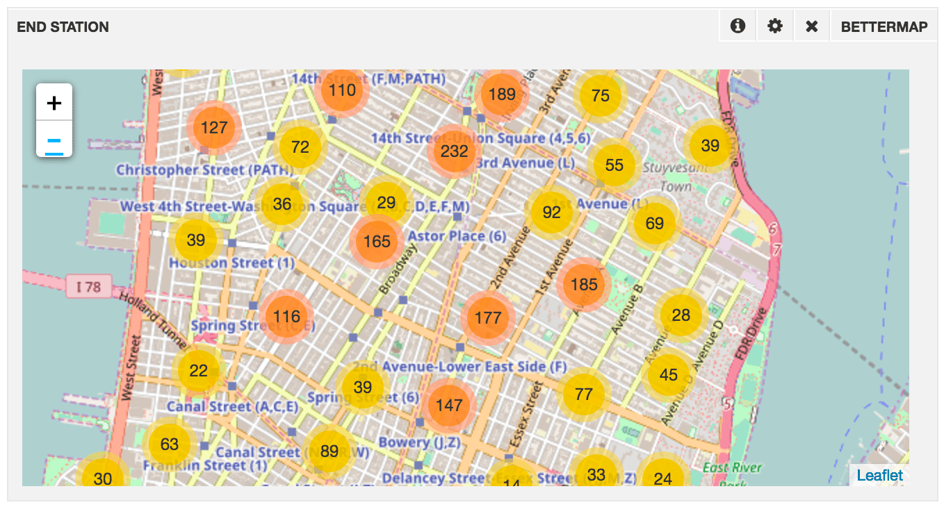
Better Map. Display geolocated points in clustered groups on a map. As you zoom out, points are clustered into fewer groups. As you zoom in, points are clustered into fewer groups (and at some point are not clustered). The Better Map panel does not use the geospatial search capabilities of Solr. It transfers more data than the Map panel and generally requires more computation, while showing less data. If you have a time filter, the panel will show the most recent points in your search, up to your defined limit. This panel is best used after filtering the results through other queries and filter queries, or when you want to inspect a recent sample of points.
-
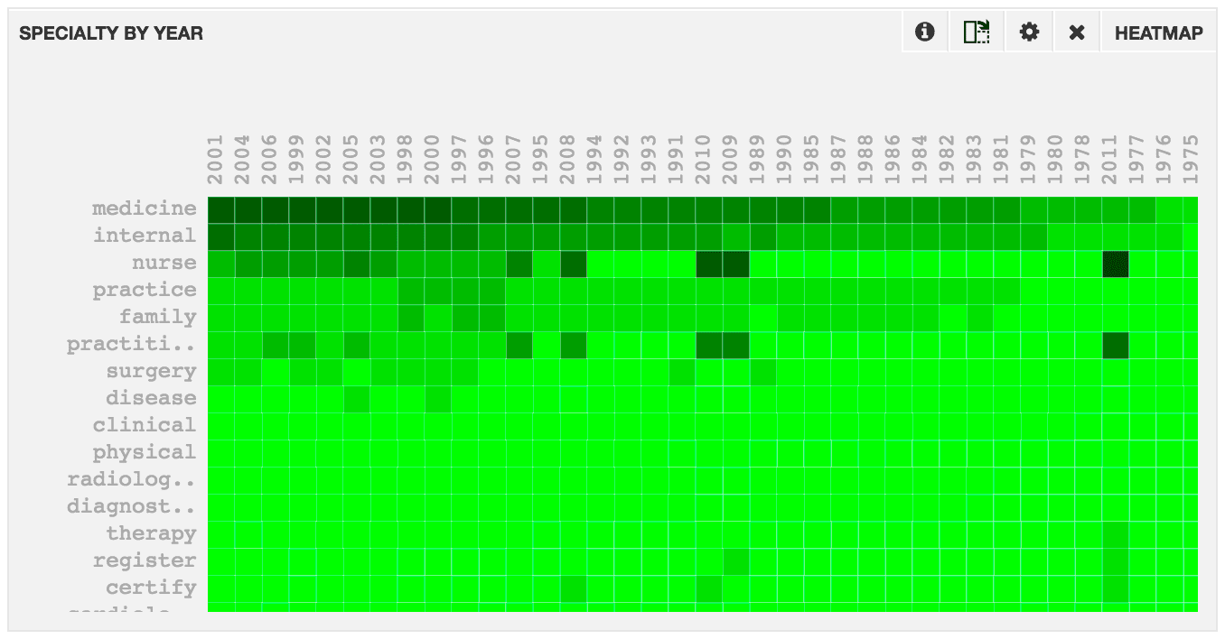
Heat Map. Display a heat map, that is, a graphical representation of data along two facet axes.
-
Histogram. Display a histogram. When used in
countmode, this is a bucketed chart of the current query, including all applied time and non-time filters. When used invaluesmode, the histogram plots the value of a specific field over time, and lets the user group the values based on the values of a second field.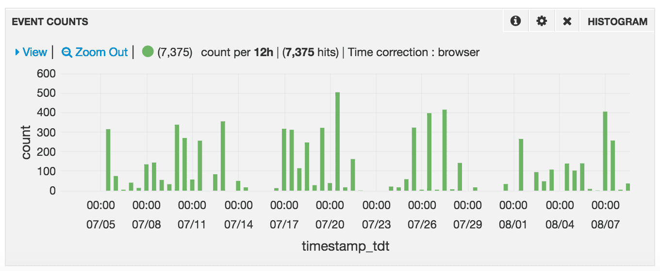
-
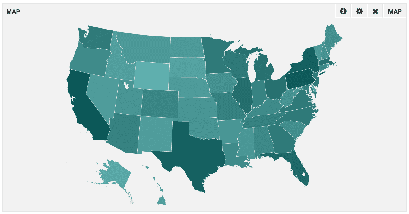
Map. Display a map of shaded regions using a field that contains a 2-letter country code or U.S. state code. Regions with more hits are shaded darker. Instead of a count, you can choose to shade regions based on the minimum, maximum, mean, or sum. The map panel uses facets, so it is important that you set field values to the appropriate 2-letter codes at index time.
-
Multi-series. Graph multiple fields of the same type that vary with time in the same graph. The X-axis is used for the time series field. Values in the other fields are graphed along the Y-axis.
-
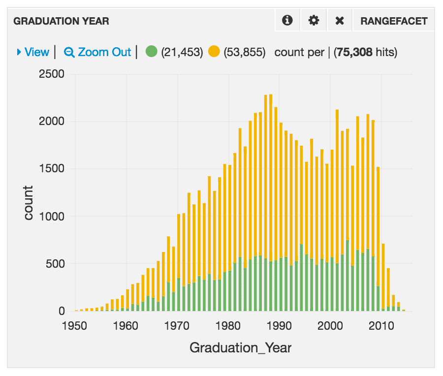
Range Facet. Display a histogram of a numeric field. The Range Facet panel is similar to the time series histogram. It lets you select ranges and zooming in/out to the desired numeric range. Range selections in the panel are reflected across the entire dashboard. With multiple search boxes in a Query panel, the Rangefacet panel can display multiple data sets, as shown in this example:
-
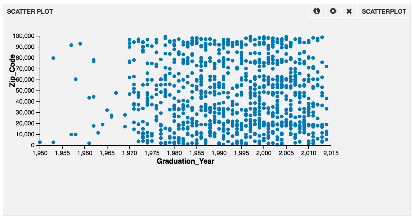
Scatter Plot. Display a scatter plot between two variables or four variables.
-
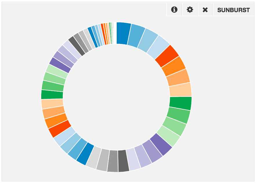
Sunburst. Display a sunburst plot based on facets.
-
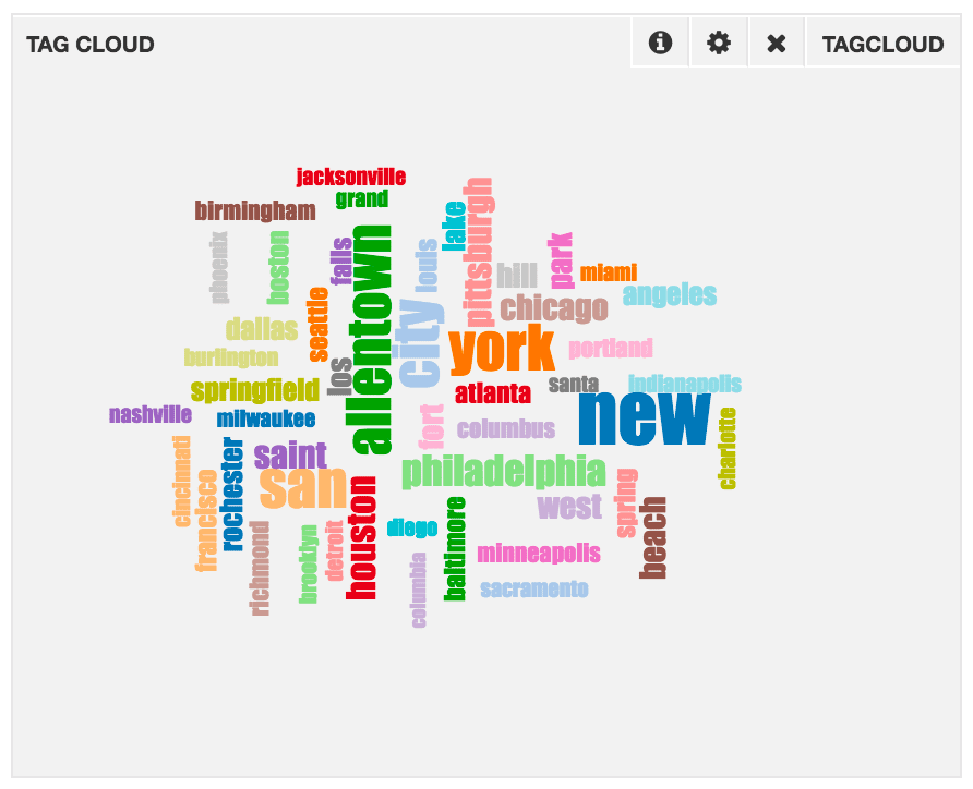
Tag Cloud. Display a tag cloud of the top N words in a field.
-
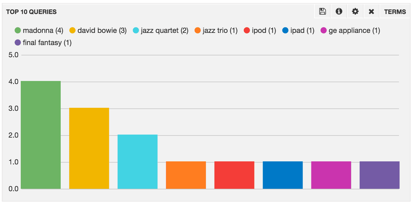
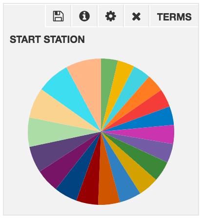
Terms. Display the count, minimum, maximum, mean, or sum for a Solr facet as a bar chart, pie chart, or table.