widget:slide-down
Table of Contents
Description
The toggle panes directive
Usage
as attribute
<ANY widget-slide-down
     [duration="{string}"]
     [easing="{string}"]
     [closed="{boolean}"]
     [height="{Number}"]
     [response="{Object}"]>
   ...
</ANY>
as class
<ANY class="widget-slide-down [duration: {string};] [easing: {string};] [closed: {boolean};] [height: {Number};] [response: {Object};]">
   ...
</ANY>
Directive info
-
This directive creates new scope.
Parameters
| Param | Type | Details |
|---|---|---|
duration (optional) |
string |
Duration of the animation. Default 0.3 (seconds) |
easing (optional) |
string |
CSS timing function i.e. ease-out |
closed (optional) |
boolean |
Starts the slidable element off as open |
height (optional) |
Number |
Set the height of the opened panel. Useful if the content is dynamically loaded. |
response (optional) |
Object |
Wait for a response before calculating the height and check for updates |
Example
Source
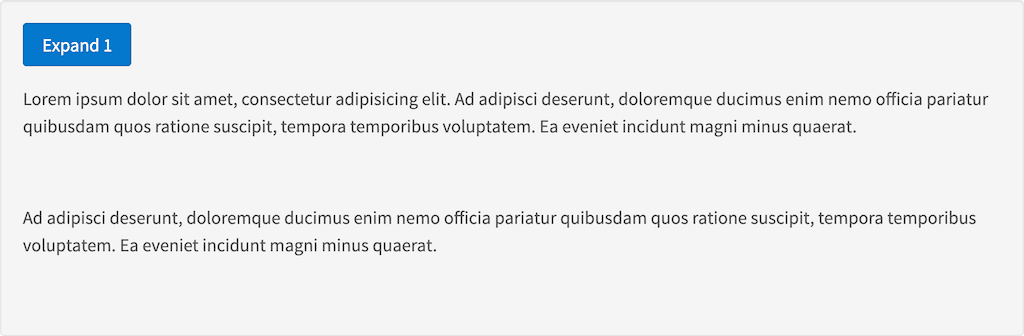
<button class="tk-stl-button" widget-slide-toggle="#foo1">Expand 1</button>
<div id="foo1" class="widget-slide-down">
    <p>Lorem ipsum dolor sit amet, consectetur adipisicing elit. Ad adipisci deserunt, doloremque ducimus enim nemo officia pariatur quibusdam quos ratione suscipit, tempora temporibus voluptatem. Ea eveniet incidunt magni minus quaerat.</p>
    <br>
    <p padding-bottom="2">Ad adipisci deserunt, doloremque ducimus enim nemo officia pariatur quibusdam quos ratione suscipit, tempora temporibus voluptatem. Ea eveniet incidunt magni minus quaerat.</p>
</div>