content:input
Table of Contents
Description
Creates a textbox
Usage
as element:
<content:input
       label="{string}"
       field="{string}"
       [required]
       [value="{string}"]
       [hidden="{boolean}"]
       [placeholder="{string}"]>
</content:input>
Parameters
| Param | Type | Details |
|---|---|---|
label |
string |
The label for the textbox |
field |
string |
The name of the field. |
required (optional) |
boolean |
Whether the field is required not, if it is a warning will be displayed until the field is value. Default:false. |
value (optional) |
string |
Value to display in the textbox. |
hidden (optional) |
boolean |
Whether the textbox should be displayed. |
placeholder (optional) |
string |
The placeholder for the textbox, if no placeholder is defined the label will be used as the placeholder. |
Example
Source
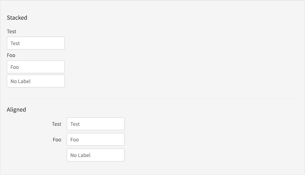
<h3 id="example_stacked">Stacked</h3>
<content:form styling="form-stacked">
    <content:input label="Test" field="test"></content:input>
    <content:input label="Foo" field="bar"></content:input>
    <content:input label="" field="barfoo" placeholder="No Label"></content:input>
</content:form>
<hr/>
<h3 id="example_aligned">Aligned</h3>
<content:form styling="form-aligned">
    <content:input label="Test" field="test"></content:input>
    <content:input label="Foo" field="bar"></content:input>
    <content:input label="" field="barfoo" placeholder="No Label"></content:input>
</content:form>