Knnfit (knnfit)
The knnfit function uses nearest neighbor regression to predict a curve through a bi-variate scatter plot. Nearest neighbor regression predicts based on the average of the k nearest neighbors in the sample set. This produces a curve that becomes smoother as k increases. The knnfit function takes three parameters:
-
The numeric field containing the independent (x) variable
-
The numeric field containing the dependent (y) variable
-
The number for k, the number of nearest neighbors from which to compute the average
Sample syntax
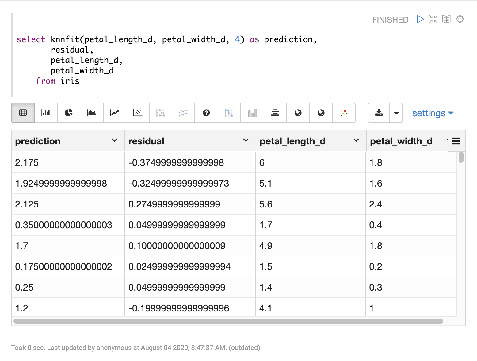
select knnfit(petal_length_d, petal_width_d, 4) as prediction,
       residual,
       petal_length_d,
       petal_width_d
from iris
       limit 150
Result set
The result set contains a random sample of records that match the WHERE clause.
If no WHERE clause is included, the random sample will be taken from the entire result set.
The size of the result set can be controlled by the LIMIT clause. The default size, if no limit is applied, is 25,000.
The knnfit function returns the predicted value for each record. There are three additional fields that can be selected when the knnfit function is used:
-
residual: the residual value for each sampleThe residual value is the sample’s dependent (y) minus the predicted value. The residual represents the error of the regression prediction for each sample.
-
the independent variable for each sample
-
the dependent variable for each sample

Visualization
There are a number of visualizations that can flow from the regression result set.
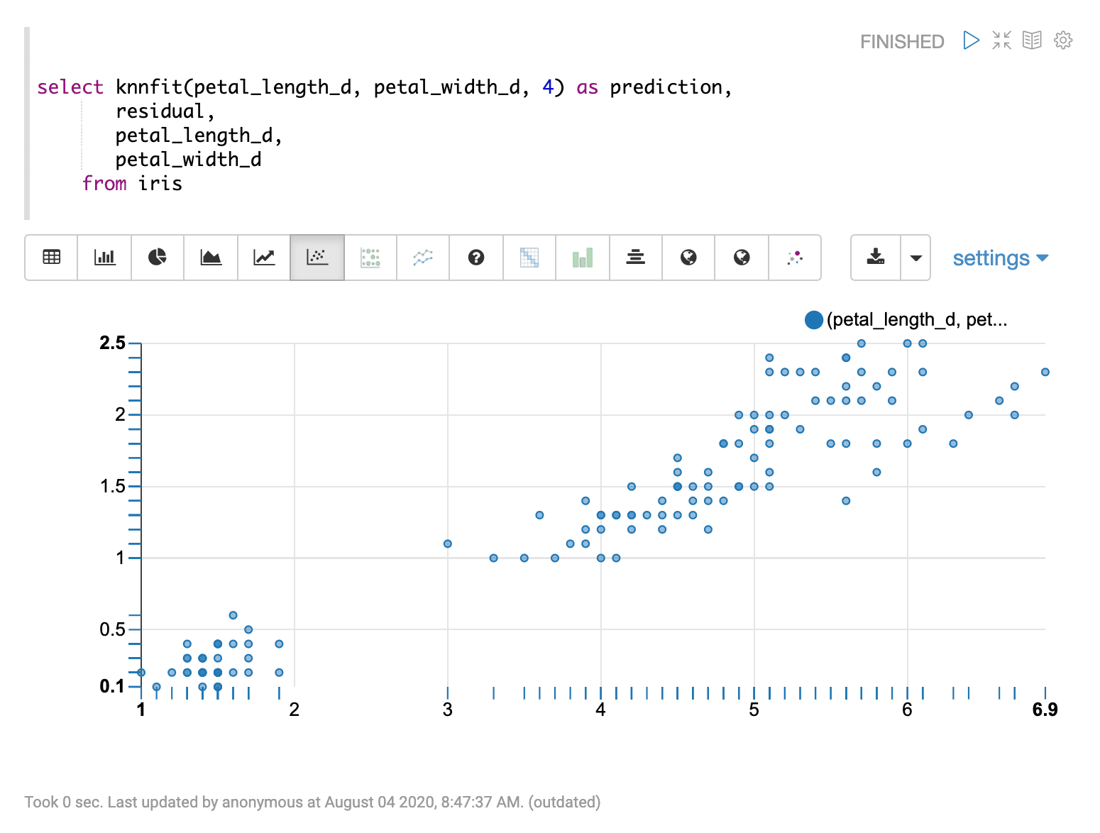
The first visualization shown is a scatter plot with petal_length_d on the x-axis and petal_width_d on the y-axis. This can be used to visualize the relationship between the two variables in the regression analysis.

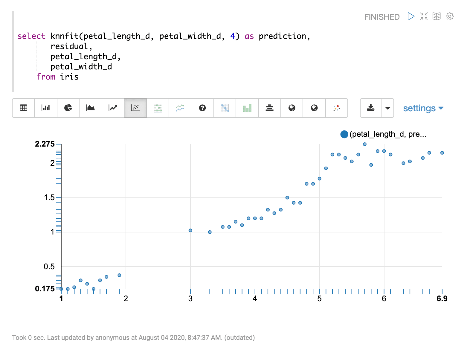
The second visualization shows the petal_length_d variable on the x-axis and the prediction for petal_width_d on y-axis.

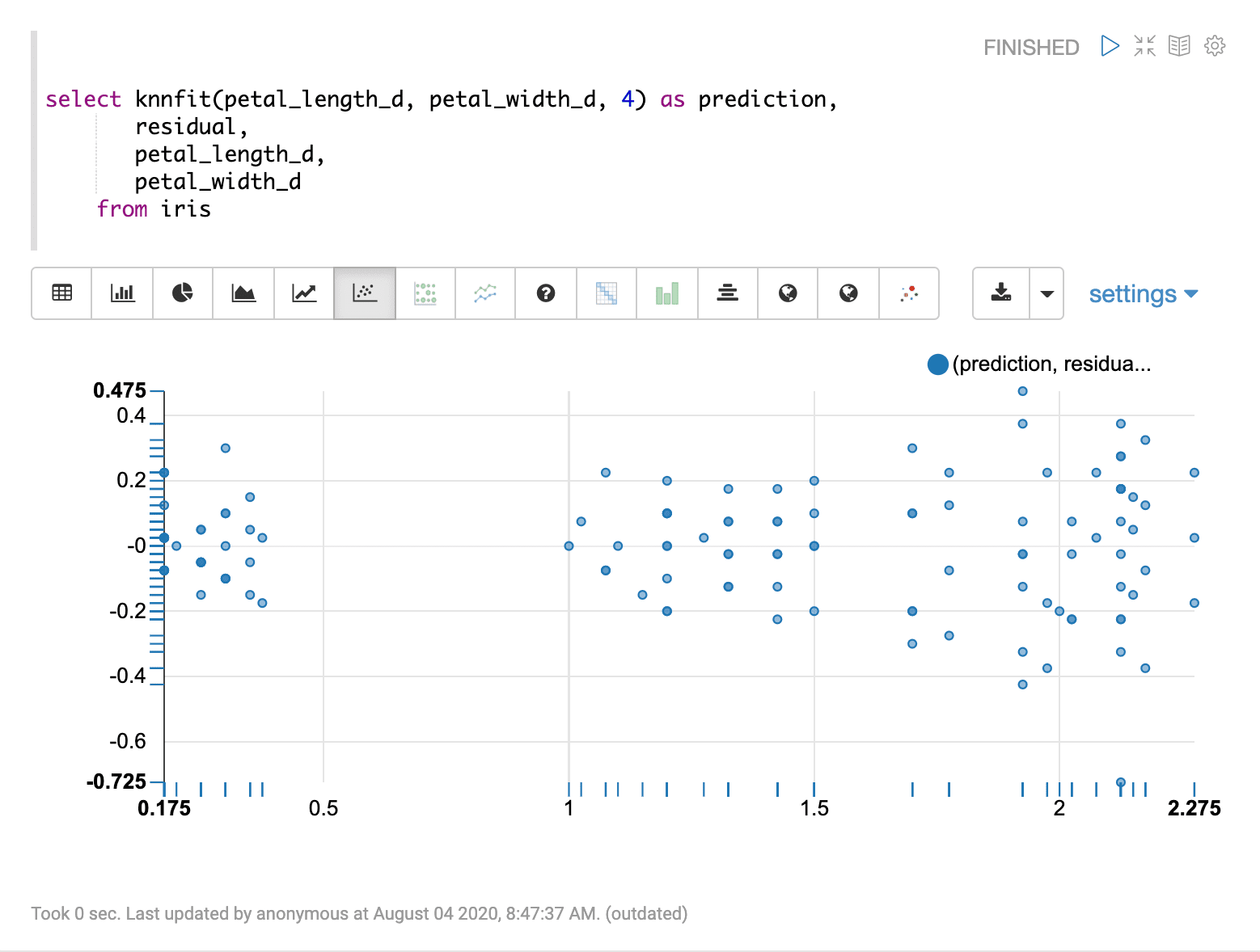
The last visualization plots the predictions on the x-axis and the residual on the y-axis. This residual plot can be used to visualize the error of the regression model across the full range of predictions.
