> ## Documentation Index
> Fetch the complete documentation index at: https://doc.lucidworks.com/llms.txt
> Use this file to discover all available pages before exploring further.
# UI Studio
> Build interactive search experience pages with drag-and-drop canvas sections, pre-built components, and no-code configuration.
UI Studio lets you create and publish search experience pages without writing code. Arrange pre-built components on visual canvas sections, connect them to your datastore, and deploy directly to your users.

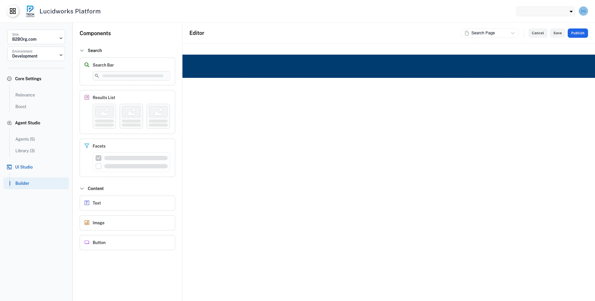
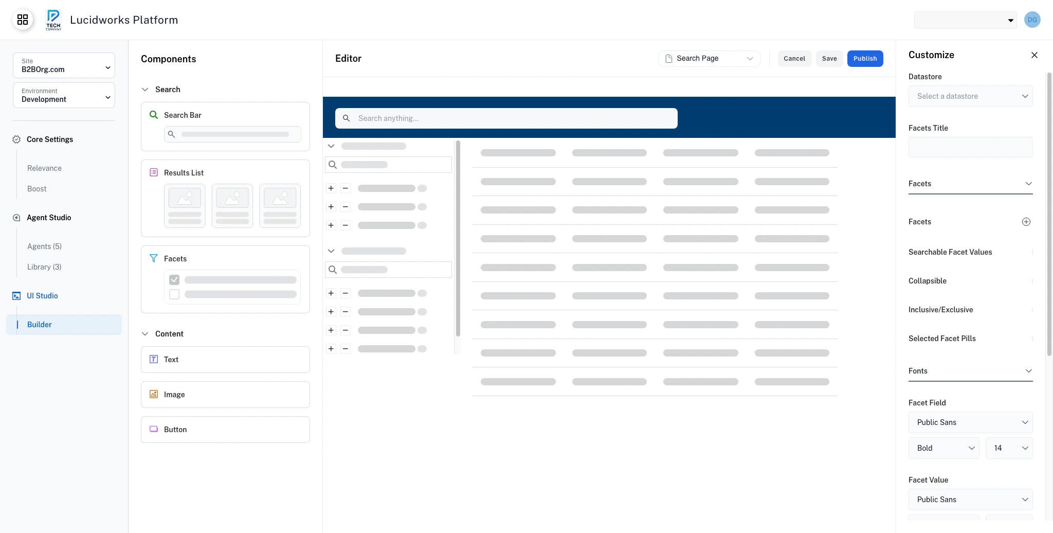 ## How UI Studio works
**Compositions are standalone web experiences.** A composition works like a self-contained website, made up of one or more pages, each with its own URL. Arrange components on each page's canvas sections, configure them independently, and publish when ready.
**Components reflect your data.** Components retrieve and display data from a configured datastore. Your datastore changes update automatically.
**Configuration is visual.** Use the Customize panel to adjust component settings, styling, and behavior without editing code.
**Your changes are backed up automatically.** UI Studio saves your composition history as you work. If you need to revert a critical change, contact your Lucidworks representative.
**Publishing generates a public URL.** When you publish, your composition is hosted and immediately available to your users.
## Get started
Get up and running with your first UI Studio page in minutes.
## Build your app
Arrange and manage page layouts using composition canvas sections.
## Components
Use pre-built components to build interactive search experiences.
Accept user queries and trigger search across your datastore.
Display search results views with sorting and pagination.
Let users narrow results by filtering on field values.
Add navigation, export, or action buttons to your pages.
Display images with optional links, borders, and fallback support.
Add static or dynamic text content with rich styling options.
## How UI Studio works
**Compositions are standalone web experiences.** A composition works like a self-contained website, made up of one or more pages, each with its own URL. Arrange components on each page's canvas sections, configure them independently, and publish when ready.
**Components reflect your data.** Components retrieve and display data from a configured datastore. Your datastore changes update automatically.
**Configuration is visual.** Use the Customize panel to adjust component settings, styling, and behavior without editing code.
**Your changes are backed up automatically.** UI Studio saves your composition history as you work. If you need to revert a critical change, contact your Lucidworks representative.
**Publishing generates a public URL.** When you publish, your composition is hosted and immediately available to your users.
## Get started
Get up and running with your first UI Studio page in minutes.
## Build your app
Arrange and manage page layouts using composition canvas sections.
## Components
Use pre-built components to build interactive search experiences.
Accept user queries and trigger search across your datastore.
Display search results views with sorting and pagination.
Let users narrow results by filtering on field values.
Add navigation, export, or action buttons to your pages.
Display images with optional links, borders, and fallback support.
Add static or dynamic text content with rich styling options.