> ## Documentation Index
> Fetch the complete documentation index at: https://doc.lucidworks.com/llms.txt
> Use this file to discover all available pages before exploring further.
# Search Bar
> Interactive search input with typeahead autocomplete suggestions in UI Studio applications
The Search Bar component in UI Studio provides a text input field for users to search for content. Use search bars to enable keyword searching with optional typeahead autocomplete that suggests results as users type. The component supports customizable placeholder text, styling, and configurable typeahead suggestions.
Pair the search bar component with the [results component](/docs/lw-platform/lw-ui-studio/components/results) and the [facets component](/docs/lw-platform/lw-ui-studio/components/facets) to build a complete search experience.
## Basic usage
Add a search bar component to your UI Studio page to enable search capability. To build a minimal search component, you must set values for the Name and Datastore fields.
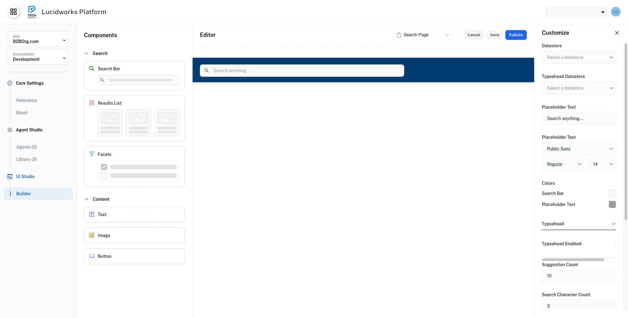 Users type queries and press Enter to search.
## Typeahead
You can enable autocomplete suggestions that appear as users type. When typeahead is enabled, the search bar displays a dropdown of suggested queries as users type. Users can:
* Click a suggestion to search for it.
* Use arrow keys to navigate suggestions.
* Press Enter to search the highlighted suggestion.
* Press Escape to close the dropdown.
To configure typeahead, you must have a configured typeahead datasource. This datasource can be the same as your primary datasource for search. If the endpoint is missing or unreachable, UI Studio automatically deactivates typeahead to prevent errors.
Typeahead suggestions improve discoverability and reduce typos, but they also add complexity. Turn the typeahead setting off for simple search scenarios or when your dataset is small.
Expand the **Typeahead** section to configure autocomplete behavior and appearance.
### Suggestion count
Set the maximum number of typeahead suggestions to display in the **Suggestion Count** field.
Enter a number in the **Suggestion Count** field, for example, 5, 10, or 15.
The default value is 10 suggestions. Keep suggestion counts between 5 and 10 to balance performance and suggestion variety. Too few suggestions limit discovery, while too many suggestions can overwhelm users.
### Search character count
Set the minimum number of characters required before showing suggestions. Enter a number in the **Search Character Count** field, for example, 2, 3, or 4.
Setting a higher number prevents typeahead from triggering on very short queries that would return too many broad suggestions. If you have a dataset with distinct terms, use a lower value.
Higher character counts reduce the number of typeahead API calls, improving performance. However, higher character counts also delay when users see useful suggestions.
## Configuration properties
Component identifier for organization and reference. The name does not display on your user-facing website.
Primary data source for search queries. Must be configured in your UI Studio application.
Data source for autocomplete suggestions. This datastore can be the same as the main datastore or a separate optimized source. If the endpoint is missing or unreachable, typeahead is automatically deactivated to prevent errors.
Hint text displayed when the search bar is empty. Should be concise and descriptive.
Typography settings for placeholder text.
Font family for placeholder text.
Font weight for placeholder text.
Standard weight.
Heavy weight.
Font size in pixels for placeholder text.
Color scheme for the search bar.
Background color for the search input field.
Text color for placeholder text. Should be lighter than entered text for clear distinction.
Autocomplete suggestion settings.
When enabled, displays autocomplete suggestions as users type. Typeahead is enabled by default but requires a configured Typeahead datastore. This datastore can be the same as your search datastore. If no datastore is configured, typeahead is automatically deactivated.
Maximum number of autocomplete suggestions to display.
Recommended range: 5 to 10
Minimum number of characters required before showing typeahead suggestions.
Recommended range: 2 to 5
Background color for the suggestions dropdown.
Background color when hovering over a suggestion.
Background color for keyboard-selected suggestions.
Background color for actively selected items.
Text color for suggestion items.
Font family for typeahead suggestion text.
Font weight for typeahead suggestion text.
Font size in pixels for typeahead suggestion text.
Users type queries and press Enter to search.
## Typeahead
You can enable autocomplete suggestions that appear as users type. When typeahead is enabled, the search bar displays a dropdown of suggested queries as users type. Users can:
* Click a suggestion to search for it.
* Use arrow keys to navigate suggestions.
* Press Enter to search the highlighted suggestion.
* Press Escape to close the dropdown.
To configure typeahead, you must have a configured typeahead datasource. This datasource can be the same as your primary datasource for search. If the endpoint is missing or unreachable, UI Studio automatically deactivates typeahead to prevent errors.
Typeahead suggestions improve discoverability and reduce typos, but they also add complexity. Turn the typeahead setting off for simple search scenarios or when your dataset is small.
Expand the **Typeahead** section to configure autocomplete behavior and appearance.
### Suggestion count
Set the maximum number of typeahead suggestions to display in the **Suggestion Count** field.
Enter a number in the **Suggestion Count** field, for example, 5, 10, or 15.
The default value is 10 suggestions. Keep suggestion counts between 5 and 10 to balance performance and suggestion variety. Too few suggestions limit discovery, while too many suggestions can overwhelm users.
### Search character count
Set the minimum number of characters required before showing suggestions. Enter a number in the **Search Character Count** field, for example, 2, 3, or 4.
Setting a higher number prevents typeahead from triggering on very short queries that would return too many broad suggestions. If you have a dataset with distinct terms, use a lower value.
Higher character counts reduce the number of typeahead API calls, improving performance. However, higher character counts also delay when users see useful suggestions.
## Configuration properties
Component identifier for organization and reference. The name does not display on your user-facing website.
Primary data source for search queries. Must be configured in your UI Studio application.
Data source for autocomplete suggestions. This datastore can be the same as the main datastore or a separate optimized source. If the endpoint is missing or unreachable, typeahead is automatically deactivated to prevent errors.
Hint text displayed when the search bar is empty. Should be concise and descriptive.
Typography settings for placeholder text.
Font family for placeholder text.
Font weight for placeholder text.
Standard weight.
Heavy weight.
Font size in pixels for placeholder text.
Color scheme for the search bar.
Background color for the search input field.
Text color for placeholder text. Should be lighter than entered text for clear distinction.
Autocomplete suggestion settings.
When enabled, displays autocomplete suggestions as users type. Typeahead is enabled by default but requires a configured Typeahead datastore. This datastore can be the same as your search datastore. If no datastore is configured, typeahead is automatically deactivated.
Maximum number of autocomplete suggestions to display.
Recommended range: 5 to 10
Minimum number of characters required before showing typeahead suggestions.
Recommended range: 2 to 5
Background color for the suggestions dropdown.
Background color when hovering over a suggestion.
Background color for keyboard-selected suggestions.
Background color for actively selected items.
Text color for suggestion items.
Font family for typeahead suggestion text.
Font weight for typeahead suggestion text.
Font size in pixels for typeahead suggestion text.