> ## Documentation Index
> Fetch the complete documentation index at: https://doc.lucidworks.com/llms.txt
> Use this file to discover all available pages before exploring further.
# Results
> Display search results with sorting, pagination, conditional row coloring, and dynamic row linking
The Results component displays search results from your datastore in a table format. Use this component to present search findings, product listings, data tables, or any collection of records. The component supports sorting, pagination, conditional row coloring, and dynamic page linking.
## Basic usage
Add a Results component to your UI Studio page to display search results. The component typically works alongside a [Search Bar component](/docs/lw-platform/lw-ui-studio/components/search-bar) and [Facets component](/docs/lw-platform/lw-ui-studio/components/facets) to display and filter query results, but can also work standalone.
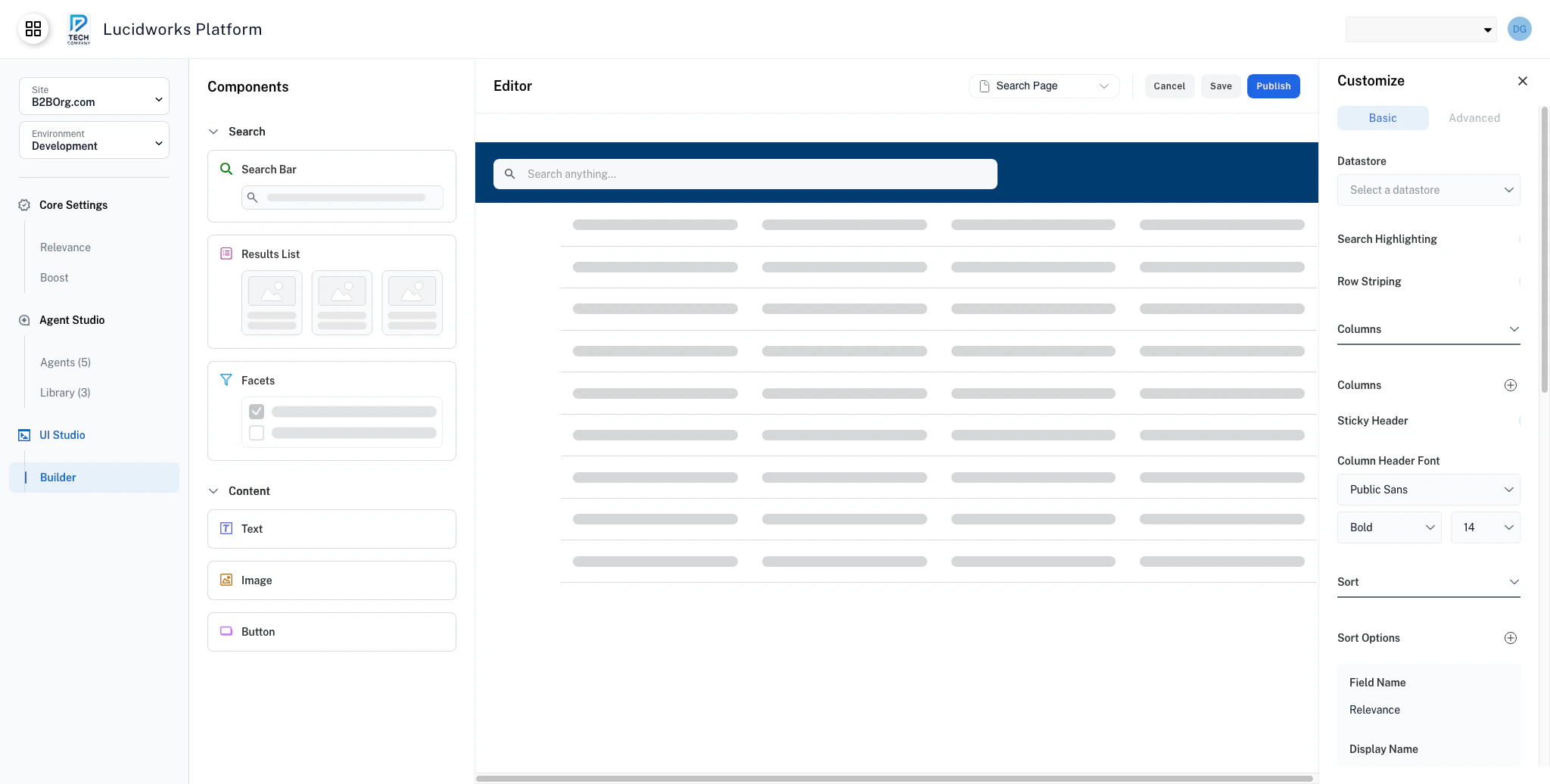 When no search query is active, the component displays all records by default. The Results component updates when users apply filters or perform searches.
The Results component supports a variety of content types and layouts. Common use cases include:
* **Product listings**: A catalog of items for sale, such as an ecommerce store. Create results listings with images, prices, and "Add to Cart" buttons.
* **Search results**: A display of documents or records matching a user query. Create results listings with titles, descriptions, and snippets.
* **Data tables**: A structured view for tabular data users need to compare or filter. Create results listings with sorting and conditional coloring for status.
* **User directory**: A browsable list of users or contacts with role information. Create results listings with profile links and role-based coloring.
* **Document library**: A collection of files organized for browsing and download. Create results listings with file types, dates, and download links.
## Display your results
The table view displays results as a structured data table with columns and rows. This layout is best for structured data and sortable datasets, as the table view is optimized for dense information display.
Click the **+** next to **Columns** to display a column in the results. Columns display in the order that they are added.
To keep column headers visible while you scroll through results, turn on the **Sticky Header** toggle.
## Sort options
Configure the sort criteria for users. Use these options so that users can sort the results by preset criteria, such as price, name, or quantity.
The sort options display in a dropdown menu above the search results. Sorting by relevance is included by default.
The sort options display in the order that you added them. The default Relevance option always appears first in the user-facing dropdown, even though it is listed last in the configuration panel.
## Pagination
Use pagination to configure the number of results per page and how many results the user can choose to display per page.
When pagination is turned off, only the first page of results displays.
When you enable pagination, you can set the default number of results to display per page in the **Default Results Count** field. The default value is 10 results.
You can also configure the number of results to display per page for users to select. Set these values in the **Results Count** fields, listed from lowest to highest.
## Conditional row coloring
Use conditional row coloring to apply background and text color to rows based on field values, making it easy to surface important information at a glance. Use this feature to flag inventory items with low stock, highlight tasks that are past due, distinguish active records from inactive ones, or draw attention to high-priority items without requiring users to sort or filter the table themselves.
Each rule evaluates a field against a condition and a value, then applies the configured colors to any matching row. When you configure multiple rules, the component evaluates them in the order listed and applies the first matching rule. Rows that match no rule use the default table styling.
Because the component evaluates rules top to bottom and applies the first match, you can order rules from most critical to least critical status to ensure proper highlighting.
An ecommerce catalog uses a `stock_status` field to alert buyers and staff about inventory availability. The rule checks whether `stock_status` equals `Out of stock` and applies a red background to signal that the item is unavailable.
When no search query is active, the component displays all records by default. The Results component updates when users apply filters or perform searches.
The Results component supports a variety of content types and layouts. Common use cases include:
* **Product listings**: A catalog of items for sale, such as an ecommerce store. Create results listings with images, prices, and "Add to Cart" buttons.
* **Search results**: A display of documents or records matching a user query. Create results listings with titles, descriptions, and snippets.
* **Data tables**: A structured view for tabular data users need to compare or filter. Create results listings with sorting and conditional coloring for status.
* **User directory**: A browsable list of users or contacts with role information. Create results listings with profile links and role-based coloring.
* **Document library**: A collection of files organized for browsing and download. Create results listings with file types, dates, and download links.
## Display your results
The table view displays results as a structured data table with columns and rows. This layout is best for structured data and sortable datasets, as the table view is optimized for dense information display.
Click the **+** next to **Columns** to display a column in the results. Columns display in the order that they are added.
To keep column headers visible while you scroll through results, turn on the **Sticky Header** toggle.
## Sort options
Configure the sort criteria for users. Use these options so that users can sort the results by preset criteria, such as price, name, or quantity.
The sort options display in a dropdown menu above the search results. Sorting by relevance is included by default.
The sort options display in the order that you added them. The default Relevance option always appears first in the user-facing dropdown, even though it is listed last in the configuration panel.
## Pagination
Use pagination to configure the number of results per page and how many results the user can choose to display per page.
When pagination is turned off, only the first page of results displays.
When you enable pagination, you can set the default number of results to display per page in the **Default Results Count** field. The default value is 10 results.
You can also configure the number of results to display per page for users to select. Set these values in the **Results Count** fields, listed from lowest to highest.
## Conditional row coloring
Use conditional row coloring to apply background and text color to rows based on field values, making it easy to surface important information at a glance. Use this feature to flag inventory items with low stock, highlight tasks that are past due, distinguish active records from inactive ones, or draw attention to high-priority items without requiring users to sort or filter the table themselves.
Each rule evaluates a field against a condition and a value, then applies the configured colors to any matching row. When you configure multiple rules, the component evaluates them in the order listed and applies the first matching rule. Rows that match no rule use the default table styling.
Because the component evaluates rules top to bottom and applies the first match, you can order rules from most critical to least critical status to ensure proper highlighting.
An ecommerce catalog uses a `stock_status` field to alert buyers and staff about inventory availability. The rule checks whether `stock_status` equals `Out of stock` and applies a red background to signal that the item is unavailable.
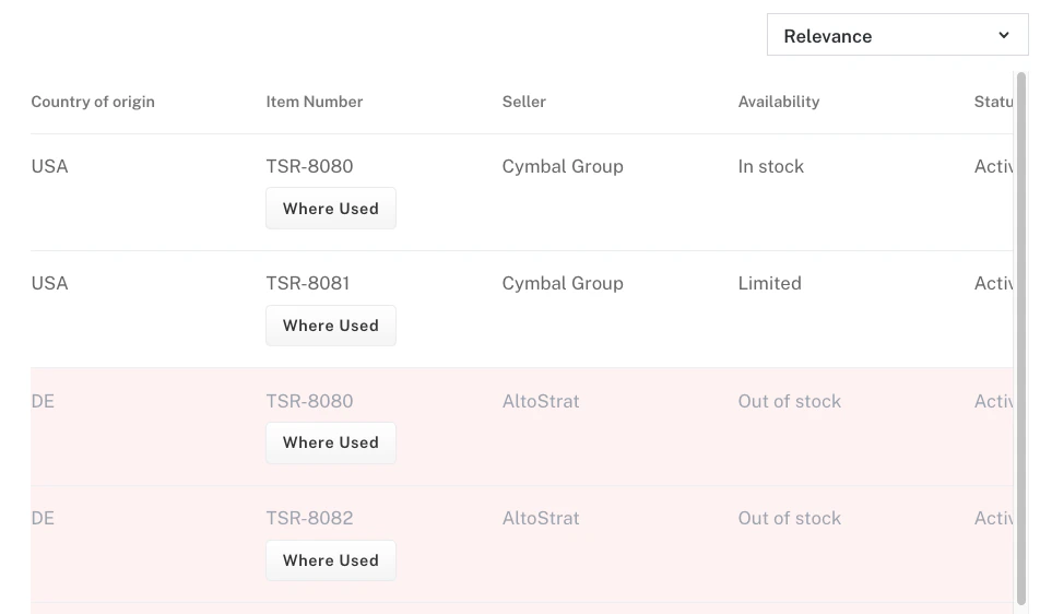 That same approach extends to any number of statuses. A second rule can check whether `stock_status` equals `Low stock` and apply a yellow background to indicate limited availability, and a third can check whether `stock_status` equals `In Stock` and apply a green background to indicate healthy inventory levels. You can continue adding rules for any status value your catalog defines.
A task management table uses a `status` field to communicate record state at a glance. One rule checks whether `status` equals `Active` and applies a green background. Another checks whether `status` equals `Inactive` and applies a gray background. A third checks whether `status` equals `Error` and applies a red background with white text.
Use subtle background tints rather than saturated colors so that text remains readable across all rows.
A support queue uses a `priority` field to help agents triage incoming requests. One rule checks whether `priority` equals `High` and applies red text. Another checks whether `priority` equals `Medium` and applies orange text. A third checks whether `priority` equals `Low` and applies green text.
Text color changes alone work well when you want to signal priority without overwhelming the table with heavy background coloring.
## Dynamic page link
Use dynamic page links to navigate users directly from a table row to a detail page, connecting your results table to the rest of your application. Use this feature to build product catalog tables where rows link to product detail pages, user directories where names link to profile pages, or document lists where entries open document viewers.
When **Link Mode** is set to **Action**, the **Display Type** setting controls how the link appears in the table. Choose **Link** when the field value is a natural, recognizable label that users expect to click, such as a username or a document title. Choose **Button** when the field value is an internal ID or technical string you do not want to display, and the action should appear as a labeled button.
To use a redirect button, define the destination URL with the **Page** base path and a **URL Template** that combines the page path with a placeholder for the field value. Wrap the placeholder in curly braces to mark where the field value is injected. The template `/products/PRODUCT_ID` resolves to `/products/ABC123` when the `PRODUCT_ID` field contains `ABC123`. You can position the placeholder anywhere in the template path, such as `/users/{username}/profile` or `/documents/{doc_id}`.
You can configure multiple dynamic links on the same table, assigning one link configuration per column. This lets you create multi-action rows with a mix of link types, such as a "View" redirect button in one column alongside an "Edit" button in another.
A product catalog table links each row to its corresponding product detail page. Set **Column** to `PRODUCT_ID`, **Link Mode** to **Action**, **Display Type** to **Button**, **Button Label** to "View Product". Set the **URL Template** to `/products/PRODUCT_ID`. A row where `PRODUCT_ID` contains `ABC123` navigates the user to `/products/ABC123`.
A user directory makes the username itself a clickable link to the user profile page. Set **Column** to `username`, **Link Mode** to **Inline**, and **URL Template** to `/users/{username}/profile`. The displayed username becomes a link without a separate button.
A document library hides the internal document ID and exposes only a labeled action button. Set **Column** to `doc_id`, **Link Mode** to **Action**, **Display Type** to **Button**, **Button Label** to "Open Document", and **URL Template** to `/documents/{doc_id}/view`. The document ID is not shown to users. Only the button is displayed.
When creating URL templates for Dynamic Page Links, test with sample data to ensure links resolve correctly. Invalid templates result in broken navigation.
## Configuration properties
### Basic configuration
Data source for results. Must be configured in your UI Studio application.
When enabled, highlights search terms within table cells to show matches visually.
When enabled, alternates row background colors for improved readability.
Configure which data fields display as table columns. Add multiple columns using the **+** button.
Field name from your datastore to display as a column.
Label shown in the column header.
How the field content is rendered.
Plain text display.
Image display.
Formatted date display.
Currency-formatted display.
Clickable link display.
When enabled, column headers remain visible while scrolling through table rows.
Typography settings for column headers.
Font family for column header text.
Font weight for column header text.
Standard weight.
Heavy weight.
Font size in pixels for column header text.
Configure available sort criteria for users. The **Relevance** option is included by default and displays last in the sort dropdown.
Available sort options. Add multiple options using the + button.
Data field to sort by.
Sort direction for this option.
Sort from lowest to highest: A-Z, 0-9, oldest to newest.
Sort from highest to lowest: Z-A, 9-0, newest to oldest.
Label shown to users in the sort dropdown.
Examples: "Price: Low to High", "Newest First", "Product Name: A-Z"
Configure pagination controls for navigating through result pages.
When enabled, displays pagination controls for navigating through result pages. Otherwise, only the first page of results displays.
Number of results displayed per page by default.
Number of results to display per page.
Number of results per page.
Add or remove values using the **+** and **-** buttons to customize available page sizes.
Visual appearance settings for the table.
Typography settings for table cell content.
Font family for cell value text.
Font weight for cell value text.
Standard weight.
Heavy weight.
Font size in pixels for cell value text.
Horizontal alignment for table cell content.
Align text to the left edge of the column.
Align text to the center of the column.
Align text to the right edge of the column.
Color scheme for the table.
Background color for the entire table.
### Advanced configuration
Apply styling to rows based on field values.
Column or field to evaluate.
Comparison operator.
Matches rows where the field equals the specified value.
Matches rows where the field does not equal the specified value.
Matches rows where the field contains the specified value.
Matches rows where the field does not contain the specified value.
Matches rows where the field value begins with the specified text.
Matches rows where the field value ends with the specified text.
Value to compare against. The type depends on field and condition.
Row background color when condition is true.
Row text color when condition is true. Ensure sufficient contrast with background.
Clickable links or buttons in table columns that navigate to detail pages.
Field that provides the link data or navigation context.
Determines how the link is integrated into the table.
Link embedded directly in the cell value.
Separate action link or button alongside the cell value.
How the action appears when Link Mode is set to Action.
Appears only when **Link Mode** is set to **Action**.
Displays as a text link.
Displays as a button.
Text displayed for the link.
Appears only when the **Display Type** is **Link** or when **Link Mode** is **Inline**.
Text displayed on the button.
Only shown when **Link Mode** is **Action** and **Display Type** is **Button**.
URL pattern with placeholders for dynamic values.
Format: Use curly braces `{field_name}` as placeholders for field values.
Examples:
* `/details/PRODUCT_ID`
* `/users/{username}/profile`
* `/documents/{doc_id}`
When enabled, treats the column value itself as a complete URL rather than injecting it into the URL Template.
When enabled, opens the link in a new browser tab instead of navigating in the current tab.
That same approach extends to any number of statuses. A second rule can check whether `stock_status` equals `Low stock` and apply a yellow background to indicate limited availability, and a third can check whether `stock_status` equals `In Stock` and apply a green background to indicate healthy inventory levels. You can continue adding rules for any status value your catalog defines.
A task management table uses a `status` field to communicate record state at a glance. One rule checks whether `status` equals `Active` and applies a green background. Another checks whether `status` equals `Inactive` and applies a gray background. A third checks whether `status` equals `Error` and applies a red background with white text.
Use subtle background tints rather than saturated colors so that text remains readable across all rows.
A support queue uses a `priority` field to help agents triage incoming requests. One rule checks whether `priority` equals `High` and applies red text. Another checks whether `priority` equals `Medium` and applies orange text. A third checks whether `priority` equals `Low` and applies green text.
Text color changes alone work well when you want to signal priority without overwhelming the table with heavy background coloring.
## Dynamic page link
Use dynamic page links to navigate users directly from a table row to a detail page, connecting your results table to the rest of your application. Use this feature to build product catalog tables where rows link to product detail pages, user directories where names link to profile pages, or document lists where entries open document viewers.
When **Link Mode** is set to **Action**, the **Display Type** setting controls how the link appears in the table. Choose **Link** when the field value is a natural, recognizable label that users expect to click, such as a username or a document title. Choose **Button** when the field value is an internal ID or technical string you do not want to display, and the action should appear as a labeled button.
To use a redirect button, define the destination URL with the **Page** base path and a **URL Template** that combines the page path with a placeholder for the field value. Wrap the placeholder in curly braces to mark where the field value is injected. The template `/products/PRODUCT_ID` resolves to `/products/ABC123` when the `PRODUCT_ID` field contains `ABC123`. You can position the placeholder anywhere in the template path, such as `/users/{username}/profile` or `/documents/{doc_id}`.
You can configure multiple dynamic links on the same table, assigning one link configuration per column. This lets you create multi-action rows with a mix of link types, such as a "View" redirect button in one column alongside an "Edit" button in another.
A product catalog table links each row to its corresponding product detail page. Set **Column** to `PRODUCT_ID`, **Link Mode** to **Action**, **Display Type** to **Button**, **Button Label** to "View Product". Set the **URL Template** to `/products/PRODUCT_ID`. A row where `PRODUCT_ID` contains `ABC123` navigates the user to `/products/ABC123`.
A user directory makes the username itself a clickable link to the user profile page. Set **Column** to `username`, **Link Mode** to **Inline**, and **URL Template** to `/users/{username}/profile`. The displayed username becomes a link without a separate button.
A document library hides the internal document ID and exposes only a labeled action button. Set **Column** to `doc_id`, **Link Mode** to **Action**, **Display Type** to **Button**, **Button Label** to "Open Document", and **URL Template** to `/documents/{doc_id}/view`. The document ID is not shown to users. Only the button is displayed.
When creating URL templates for Dynamic Page Links, test with sample data to ensure links resolve correctly. Invalid templates result in broken navigation.
## Configuration properties
### Basic configuration
Data source for results. Must be configured in your UI Studio application.
When enabled, highlights search terms within table cells to show matches visually.
When enabled, alternates row background colors for improved readability.
Configure which data fields display as table columns. Add multiple columns using the **+** button.
Field name from your datastore to display as a column.
Label shown in the column header.
How the field content is rendered.
Plain text display.
Image display.
Formatted date display.
Currency-formatted display.
Clickable link display.
When enabled, column headers remain visible while scrolling through table rows.
Typography settings for column headers.
Font family for column header text.
Font weight for column header text.
Standard weight.
Heavy weight.
Font size in pixels for column header text.
Configure available sort criteria for users. The **Relevance** option is included by default and displays last in the sort dropdown.
Available sort options. Add multiple options using the + button.
Data field to sort by.
Sort direction for this option.
Sort from lowest to highest: A-Z, 0-9, oldest to newest.
Sort from highest to lowest: Z-A, 9-0, newest to oldest.
Label shown to users in the sort dropdown.
Examples: "Price: Low to High", "Newest First", "Product Name: A-Z"
Configure pagination controls for navigating through result pages.
When enabled, displays pagination controls for navigating through result pages. Otherwise, only the first page of results displays.
Number of results displayed per page by default.
Number of results to display per page.
Number of results per page.
Add or remove values using the **+** and **-** buttons to customize available page sizes.
Visual appearance settings for the table.
Typography settings for table cell content.
Font family for cell value text.
Font weight for cell value text.
Standard weight.
Heavy weight.
Font size in pixels for cell value text.
Horizontal alignment for table cell content.
Align text to the left edge of the column.
Align text to the center of the column.
Align text to the right edge of the column.
Color scheme for the table.
Background color for the entire table.
### Advanced configuration
Apply styling to rows based on field values.
Column or field to evaluate.
Comparison operator.
Matches rows where the field equals the specified value.
Matches rows where the field does not equal the specified value.
Matches rows where the field contains the specified value.
Matches rows where the field does not contain the specified value.
Matches rows where the field value begins with the specified text.
Matches rows where the field value ends with the specified text.
Value to compare against. The type depends on field and condition.
Row background color when condition is true.
Row text color when condition is true. Ensure sufficient contrast with background.
Clickable links or buttons in table columns that navigate to detail pages.
Field that provides the link data or navigation context.
Determines how the link is integrated into the table.
Link embedded directly in the cell value.
Separate action link or button alongside the cell value.
How the action appears when Link Mode is set to Action.
Appears only when **Link Mode** is set to **Action**.
Displays as a text link.
Displays as a button.
Text displayed for the link.
Appears only when the **Display Type** is **Link** or when **Link Mode** is **Inline**.
Text displayed on the button.
Only shown when **Link Mode** is **Action** and **Display Type** is **Button**.
URL pattern with placeholders for dynamic values.
Format: Use curly braces `{field_name}` as placeholders for field values.
Examples:
* `/details/PRODUCT_ID`
* `/users/{username}/profile`
* `/documents/{doc_id}`
When enabled, treats the column value itself as a complete URL rather than injecting it into the URL Template.
When enabled, opens the link in a new browser tab instead of navigating in the current tab.