> ## Documentation Index
> Fetch the complete documentation index at: https://doc.lucidworks.com/llms.txt
> Use this file to discover all available pages before exploring further.
# Facets
> Interactive filtering component for refining search results by categories and attributes in UI Studio applications
The Facets component in UI Studio provides interactive filters that allow users to refine search results by selecting categories, attributes, and values. Use facets to narrow down large datasets by criteria like manufacturer, category, price range, or any custom field from your data.
## Basic usage
Add a facets component to your UI Studio page to enable filtering capabilities. To build a minimal facets component, you must set a value for the Datastore field and a facet category to display.
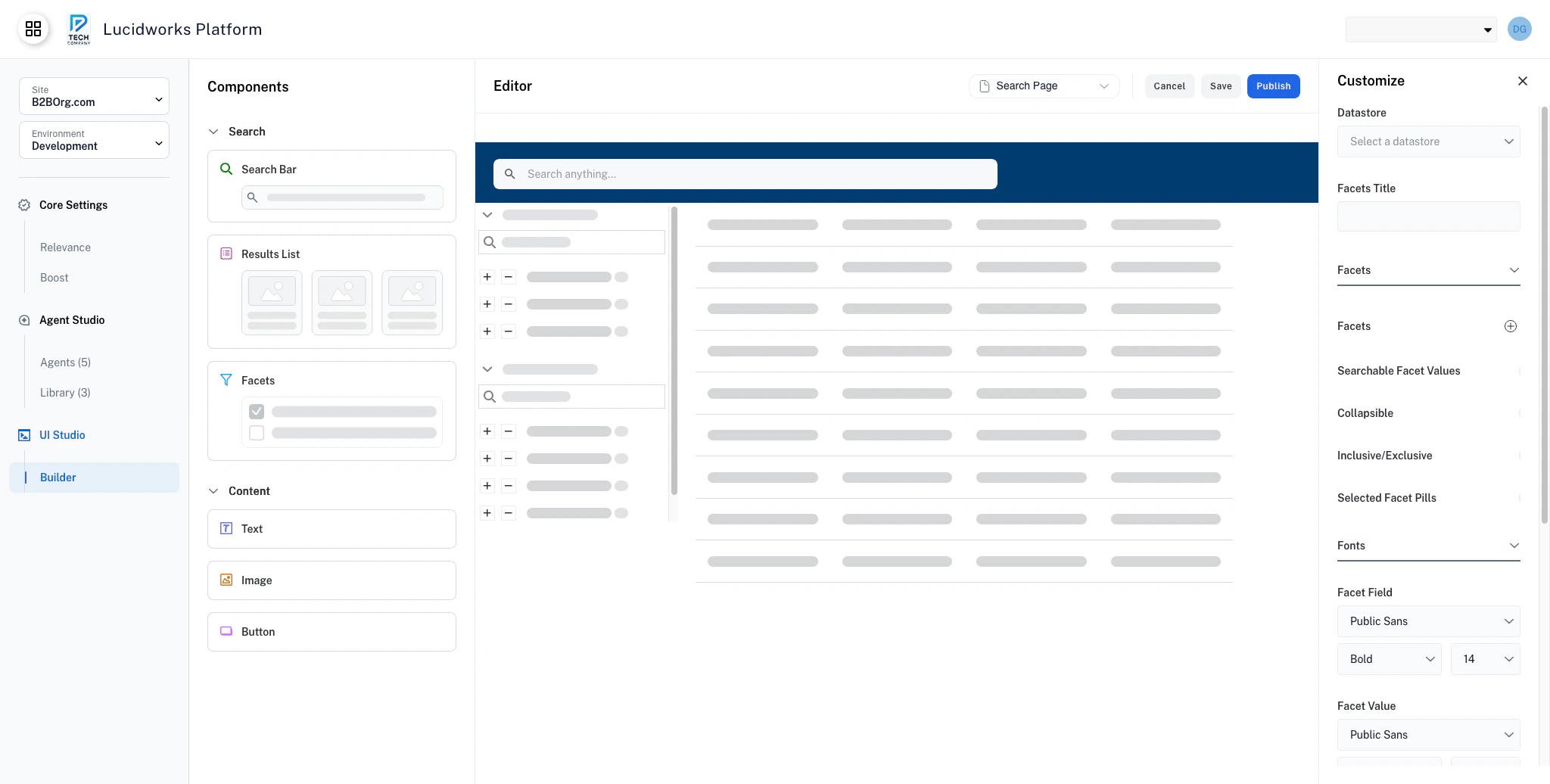 If no facets are available for the provided datastore, the component displays an empty state message: "No facets found. Please try adjusting your search criteria."
To add a facet, click the **+** next to the **Facets** selector. Facets display in a vertical list.
## Searchable facet values
Enable search within facet values for categories with many options. When enabled, a search box appears within each facet category, allowing users to quickly find specific values. This is especially useful for facets with many values, for example, cities or product models.
Toggle the **Searchable Facet Values** switch to turn this feature on or off.
## Collapsible facets
Collapsible facets let users show or hide individual facet categories to reduce visual clutter.
If no facets are available for the provided datastore, the component displays an empty state message: "No facets found. Please try adjusting your search criteria."
To add a facet, click the **+** next to the **Facets** selector. Facets display in a vertical list.
## Searchable facet values
Enable search within facet values for categories with many options. When enabled, a search box appears within each facet category, allowing users to quickly find specific values. This is especially useful for facets with many values, for example, cities or product models.
Toggle the **Searchable Facet Values** switch to turn this feature on or off.
## Collapsible facets
Collapsible facets let users show or hide individual facet categories to reduce visual clutter.
 When enabled, each facet category displays a chevron icon. Users can click to collapse categories they're not using, creating a cleaner interface. The collapsed state persists during the user's session.
Enabling collapsible facets is recommended when you have many facet categories. Users can focus on the filters they're actively using while hiding others.
Toggle the **Collapsible** switch to turn collapsible facet categories on or off.
## Inclusive and exclusive filtering
Enable advanced filtering with inclusion and exclusion operators. These filters let users include or exclude a facet from their search results and create complex filter combinations such as "show products from Sony or Samsung, but not refurbished items."
When enabled, each facet value displays plus and minus icons:
* **+ (Plus)**: Include results that match this facet value.
* **- (Minus)**: Exclude results that match this facet value.
Use inclusive and exclusive filtering for complex filtering through many facets. For simpler interfaces, turn this setting off to avoid overwhelming users with additional controls.
Toggle the **Inclusive/Exclusive** switch to turn this setting on or off.
When enabled, each facet category displays a chevron icon. Users can click to collapse categories they're not using, creating a cleaner interface. The collapsed state persists during the user's session.
Enabling collapsible facets is recommended when you have many facet categories. Users can focus on the filters they're actively using while hiding others.
Toggle the **Collapsible** switch to turn collapsible facet categories on or off.
## Inclusive and exclusive filtering
Enable advanced filtering with inclusion and exclusion operators. These filters let users include or exclude a facet from their search results and create complex filter combinations such as "show products from Sony or Samsung, but not refurbished items."
When enabled, each facet value displays plus and minus icons:
* **+ (Plus)**: Include results that match this facet value.
* **- (Minus)**: Exclude results that match this facet value.
Use inclusive and exclusive filtering for complex filtering through many facets. For simpler interfaces, turn this setting off to avoid overwhelming users with additional controls.
Toggle the **Inclusive/Exclusive** switch to turn this setting on or off.
 ## Selected facet pills
Use facet pills to display selected filters as removable pills before the facet categories. These facet pills provide a visual indicator to users about the facets they're actively filtering by.
Users can select individual facet pills to remove that filter from their current search results.
A **Clear All** link also appears, letting users remove all active filters at once.
## Selected facet pills
Use facet pills to display selected filters as removable pills before the facet categories. These facet pills provide a visual indicator to users about the facets they're actively filtering by.
Users can select individual facet pills to remove that filter from their current search results.
A **Clear All** link also appears, letting users remove all active filters at once.
 Toggle the **Selected Facet Pills** switch to turn this feature on or off.
## Configuration properties
Data source that provides facet categories and values. Must be configured in your UI Studio application.
Optional text label displayed as the heading above the facets panel.
Configure individual facet fields to display in the component.
The field name from your datastore to use as a facet.
The label shown to users for this facet category (for example, "Manufacturer", "Color").
When enabled, allows users to select multiple values within this facet category.
When enabled, adds a search box within each facet category for filtering values. This setting is recommended for facets with ten or more values.
When enabled, facet categories can be collapsed and expanded with chevron icons. The collapsed state persists in the user's session.
When enabled, displays **+** and **-** icons next to facet values for inclusive or exclusive filtering. This allows complex filter combinations like "include Sony or Samsung, but exclude refurbished".
When enabled, displays active filters as removable pills at the top with a **Clear All** option. Shows inclusive (+) or exclusive (-) indicators when Inclusive/Exclusive mode is enabled.
Typography settings for the main facets heading or title.
Font family for facets title.
Font weight for facets title.
Standard weight.
Heavy weight.
Font size in pixels for facets title.
Typography settings for facet category titles (for example, "Manufacturer", "Color").
Font family for facet category titles.
Font weight for facet category titles.
Standard weight.
Heavy weight.
Font size in pixels for facet category titles.
Typography settings for facet values (for example, "Sony", "Purple").
Font family for facet values.
Font weight for facet values.
Standard weight.
Heavy weight.
Font size in pixels for facet values.
Typography settings for the search input field within facet categories. Used when **Searchable Facet Values** is enabled.
Font family for search input text.
Font weight for search input text.
Standard weight.
Heavy weight.
Font size in pixels for search input text.
Typography settings for the "Selected Filters:" header text when Selected Facet Pills is enabled.
Font family for selected filters header.
Font weight for selected filters header.
Standard weight.
Heavy weight.
Font size in pixels for selected filters header.
Typography settings for the filter pill text when Selected Facet Pills is enabled.
Font family for filter pill text.
Font weight for filter pill text.
Standard weight.
Heavy weight.
Font size in pixels for filter pill text.
Color scheme for the facets component.
Background color for the facets container.
Color properties for the facets title.
Text color for the main facets title.
Background color for the facets title area.
Border color for the facets title area.
Color properties for the facet field.
Text color for facet category titles. Ensure sufficient contrast with background.
Background color for facet category title rows.
Border color for facet category title rows.
Color properties for the facet value.
Text color for facet values. Ensure sufficient contrast with background.
Background color when hovering over facet values.
Color properties for the facet search input.
Text color for the search input field within facet categories.
Background color for the search input field within facet categories.
Color properties for the selected filters header.
Text color for the "Selected Filters:" header label.
Text color for the "Clear All" link.
Color properties for the selected filter pill.
Text color for filter pill labels.
Background color for filter pills.
Border color for filter pills.
Color for the remove icon (×) on filter pills.
Color properties for the inclusive/exclusive buttons.
Background color for the + and - buttons when Inclusive/Exclusive mode is enabled.
Border color for the + and - buttons when Inclusive/Exclusive mode is enabled.
Background color for active + or - buttons when Inclusive/Exclusive mode is enabled.
Icon color for active + or - buttons when Inclusive/Exclusive mode is enabled.
Toggle the **Selected Facet Pills** switch to turn this feature on or off.
## Configuration properties
Data source that provides facet categories and values. Must be configured in your UI Studio application.
Optional text label displayed as the heading above the facets panel.
Configure individual facet fields to display in the component.
The field name from your datastore to use as a facet.
The label shown to users for this facet category (for example, "Manufacturer", "Color").
When enabled, allows users to select multiple values within this facet category.
When enabled, adds a search box within each facet category for filtering values. This setting is recommended for facets with ten or more values.
When enabled, facet categories can be collapsed and expanded with chevron icons. The collapsed state persists in the user's session.
When enabled, displays **+** and **-** icons next to facet values for inclusive or exclusive filtering. This allows complex filter combinations like "include Sony or Samsung, but exclude refurbished".
When enabled, displays active filters as removable pills at the top with a **Clear All** option. Shows inclusive (+) or exclusive (-) indicators when Inclusive/Exclusive mode is enabled.
Typography settings for the main facets heading or title.
Font family for facets title.
Font weight for facets title.
Standard weight.
Heavy weight.
Font size in pixels for facets title.
Typography settings for facet category titles (for example, "Manufacturer", "Color").
Font family for facet category titles.
Font weight for facet category titles.
Standard weight.
Heavy weight.
Font size in pixels for facet category titles.
Typography settings for facet values (for example, "Sony", "Purple").
Font family for facet values.
Font weight for facet values.
Standard weight.
Heavy weight.
Font size in pixels for facet values.
Typography settings for the search input field within facet categories. Used when **Searchable Facet Values** is enabled.
Font family for search input text.
Font weight for search input text.
Standard weight.
Heavy weight.
Font size in pixels for search input text.
Typography settings for the "Selected Filters:" header text when Selected Facet Pills is enabled.
Font family for selected filters header.
Font weight for selected filters header.
Standard weight.
Heavy weight.
Font size in pixels for selected filters header.
Typography settings for the filter pill text when Selected Facet Pills is enabled.
Font family for filter pill text.
Font weight for filter pill text.
Standard weight.
Heavy weight.
Font size in pixels for filter pill text.
Color scheme for the facets component.
Background color for the facets container.
Color properties for the facets title.
Text color for the main facets title.
Background color for the facets title area.
Border color for the facets title area.
Color properties for the facet field.
Text color for facet category titles. Ensure sufficient contrast with background.
Background color for facet category title rows.
Border color for facet category title rows.
Color properties for the facet value.
Text color for facet values. Ensure sufficient contrast with background.
Background color when hovering over facet values.
Color properties for the facet search input.
Text color for the search input field within facet categories.
Background color for the search input field within facet categories.
Color properties for the selected filters header.
Text color for the "Selected Filters:" header label.
Text color for the "Clear All" link.
Color properties for the selected filter pill.
Text color for filter pill labels.
Background color for filter pills.
Border color for filter pills.
Color for the remove icon (×) on filter pills.
Color properties for the inclusive/exclusive buttons.
Background color for the + and - buttons when Inclusive/Exclusive mode is enabled.
Border color for the + and - buttons when Inclusive/Exclusive mode is enabled.
Background color for active + or - buttons when Inclusive/Exclusive mode is enabled.
Icon color for active + or - buttons when Inclusive/Exclusive mode is enabled.