> ## Documentation Index
> Fetch the complete documentation index at: https://doc.lucidworks.com/llms.txt
> Use this file to discover all available pages before exploring further.
# widget:carousel
export const LwTemplate = ({title = "Key questions to get you started", icon = "sparkles", cta = "Powered by Agent Studio", linkHref = "https://lucidworks.com/demo/?utm_source=docs&utm_medium=referral&utm_campaign=docs_cta_ai"}) => {
const [isLoaded, setIsLoaded] = useState(false);
useEffect(() => {
const timer = setTimeout(() => {
setIsLoaded(true);
}, 500);
return () => clearTimeout(timer);
}, []);
return
{isLoaded && `
}} />}
Powered by Lucidworks Agent Studio
;
};
[localhost link]: http://localhost:3000/docs/4/app-studio/reference/tags/lightning.directive.widgetCarousel
[mintlify link]: https://doc.lucidworks.com/docs/4/app-studio/reference/tags/lightning.directive.widgetCarousel
[old doc.lw link]: https://doc.lucidworks.com/app-studio/4.2/1130
## Description
Creates a horizontal carousel
## Usage
as element:
```xml wrap theme={"dark"}
```
as attribute
```xml wrap theme={"dark"}
...
```
#### Parameters
| Param | Type | Details |
| ---------------------------- | ----------- | ----------------------------------------------------------------------------------------------------------------------------------------------- |
| carousel-name *(optional)* | **string** | The name of the carousel so it can be retrieved from the Carousel service. This can be used to control the carousel from another element. |
| carousel-watch *(optional)* | **Object** | A variable to watch for changes to the slides data. When creating the slides in an ngRepeat the object should be set here to watch for changes. |
| loop *(optional)* | **boolean** | Whether the carousel should loop. Default true. |
| auto-play *(optional)* | **number** | Milliseconds to wait until animating to the next slide. By default the carousel will not auto slide |
| random-start *(optional)* | **boolean** | Randomises starting slide |
| controls *(optional)* | **boolean** | Adds left and right arrows for navigation. Default true. |
| height *(optional)* | **number** | Set the height of the carousel. By default the height is dynamically set to the height of the active slide. |
| pagination *(optional)* | **boolean** | Whether to show pagination dots. Default false. |
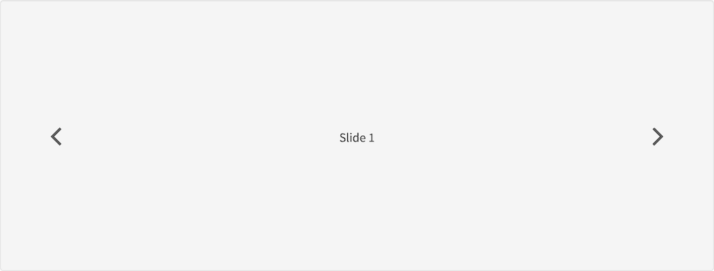
## Example
#### Source
```xml wrap theme={"dark"}
Slide 1
Slide 2
Slide 3
```
```css wrap theme={"dark"}
.demo {
min-height: 300px;
text-align: center;
margin-top: 140px;
}
.tk-stl-carousel {
display: block;
width: 100%;
height: 300px;
white-space: nowrap;
position: relative;
overflow: hidden;
transition: height .2s ease
}
.tk-stl-carousel slidecontainer {
display: block;
position: absolute;
top: 0;
width: 100%;
height: 100%;
z-index: 1;
font-size: 0
}
.tk-stl-carousel slidecontainer.carousel-ignore-first-slide {
-webkit-transform: translate(-100%, 0);
-ms-transform: translate(-100%, 0);
transform: translate(-100%, 0)
}
.tk-stl-carousel slidecontainer.carousel-animate {
transition: -webkit-transform .5s ease-out 0s;
transition: transform .5s ease-out 0s;
transition: transform .5s ease-out 0s, -webkit-transform .5s ease-out 0s
}
.tk-stl-carousel slidecontainer slide {
position: relative;
display: inline-block;
vertical-align: top;
font-size: 16px;
width: 100%;
height: 100%;
background-size: cover;
background-position: center
}
.tk-stl-carousel slidecontainer slide img {
pointer-events: none;
margin: 0 auto;
display: block
}
.tk-stl-carousel .carousel-arrow {
display: inline-block;
display: -webkit-flex;
display: -ms-flexbox;
display: flex;
-webkit-justify-content: center;
-ms-flex-pack: center;
justify-content: center;
-webkit-align-items: center;
-ms-flex-align: center;
align-items: center;
position: absolute;
top: 0;
bottom: 0;
z-index: 1;
width: 100px;
text-align: center;
cursor: pointer
}
.tk-stl-carousel .carousel-arrow.carousel-arrow-left {
left: 0
}
.tk-stl-carousel .carousel-arrow.carousel-arrow-right {
right: 0
}
.tk-stl-carousel .carousel-arrow .icon-angle-left,
.tk-stl-carousel .carousel-arrow .icon-angle-right {
font-size: 2.5em
}
```
#### Result